
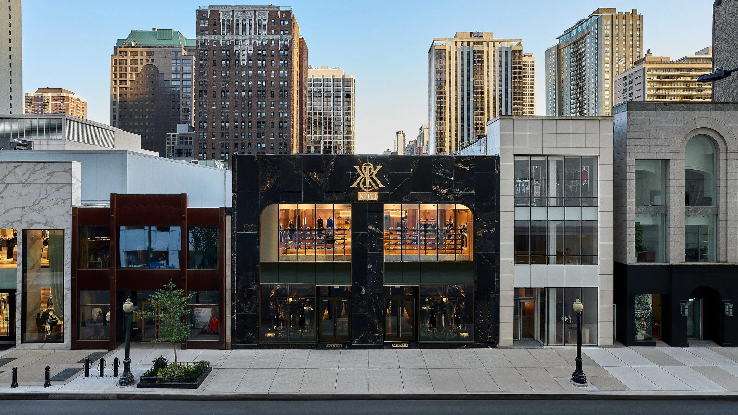
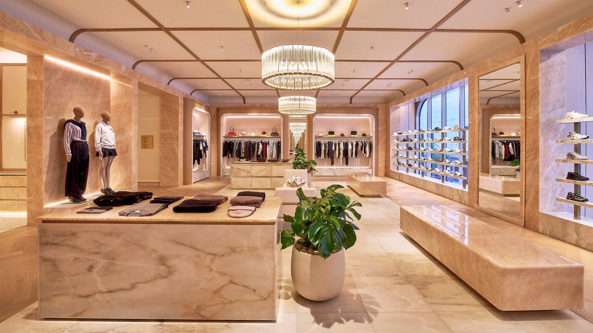
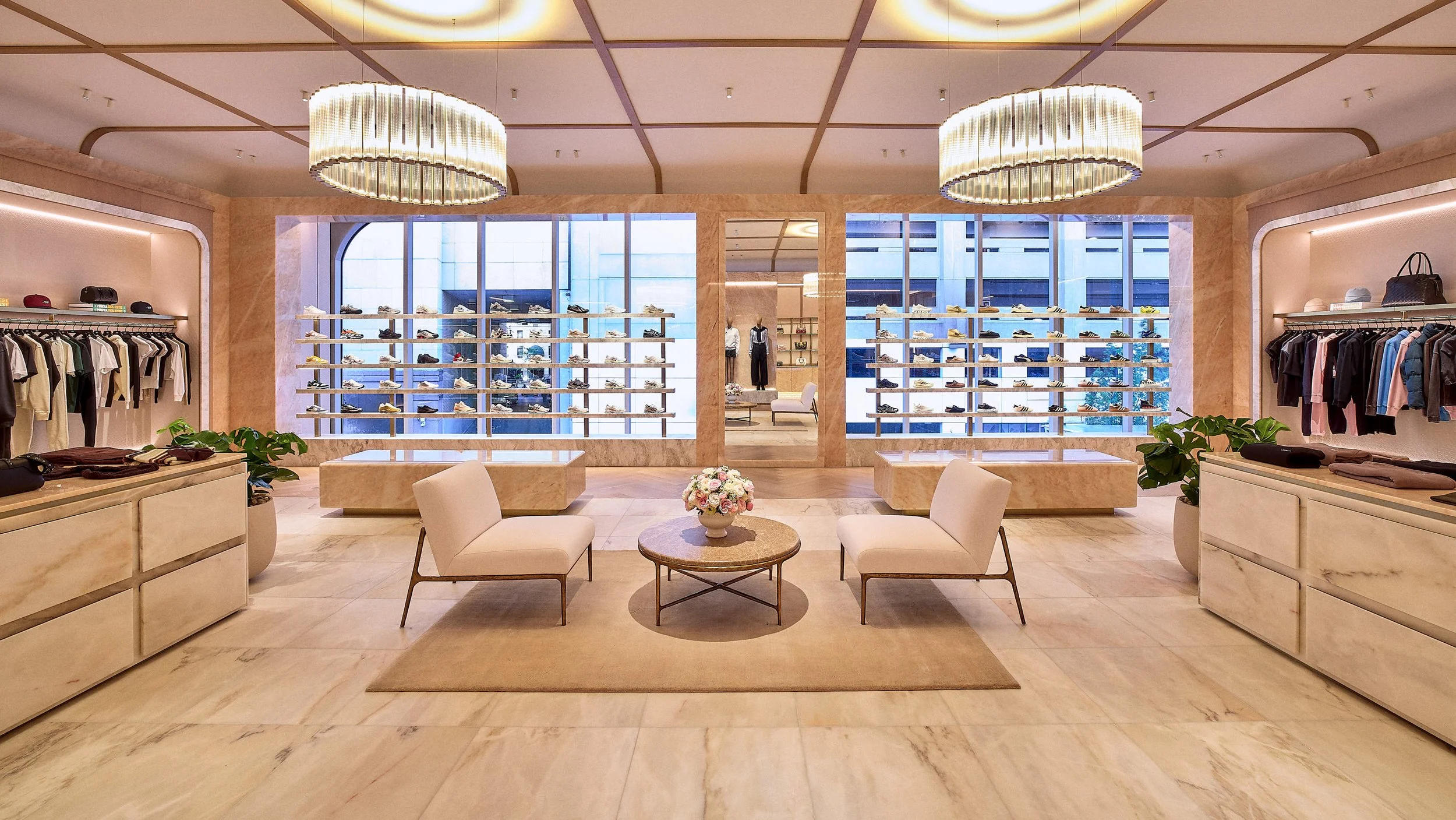
Kith West Hollywood
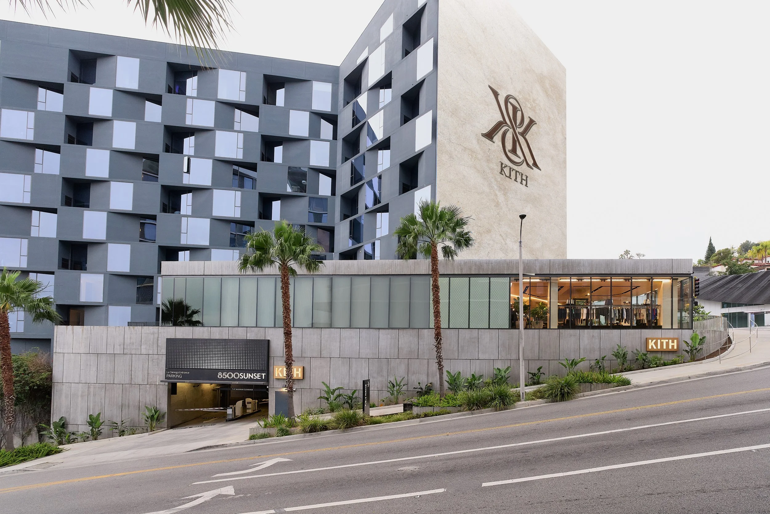
Fashion Retail
Global Flagships
West Hollywood, California
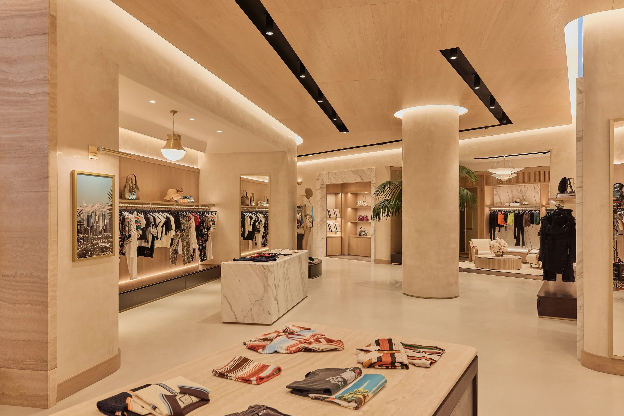
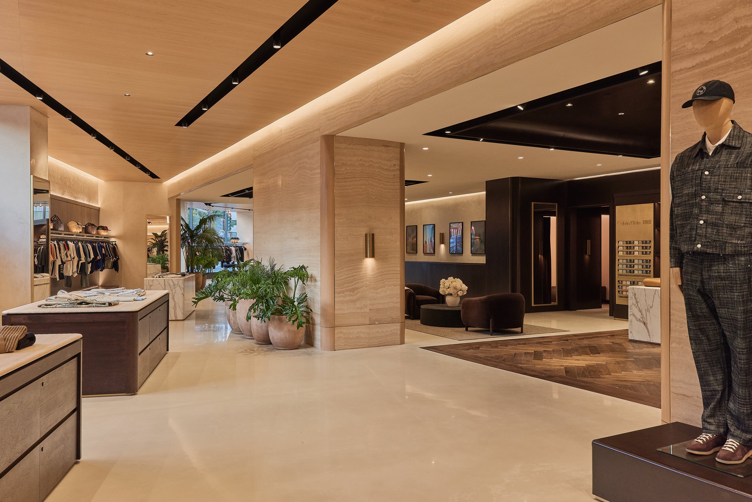
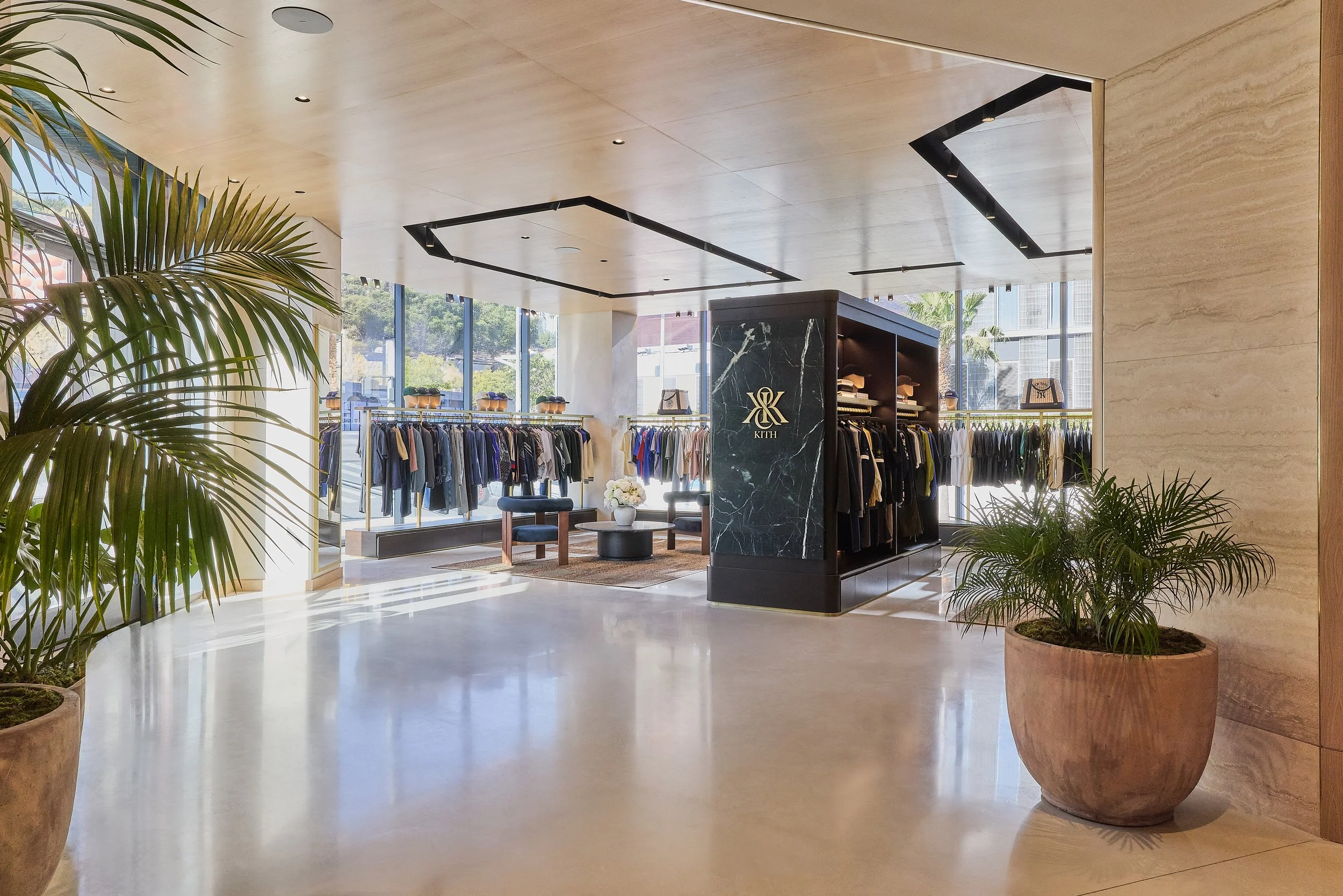
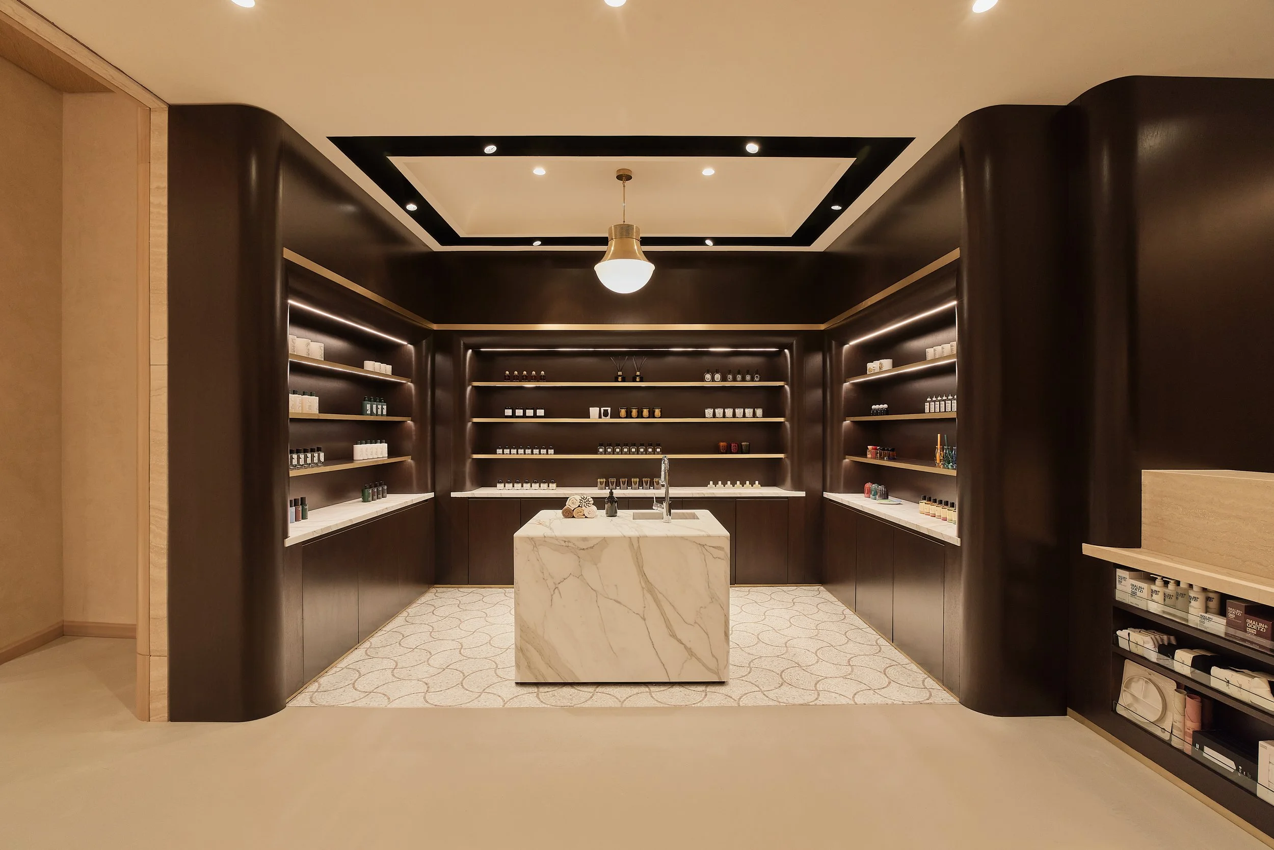
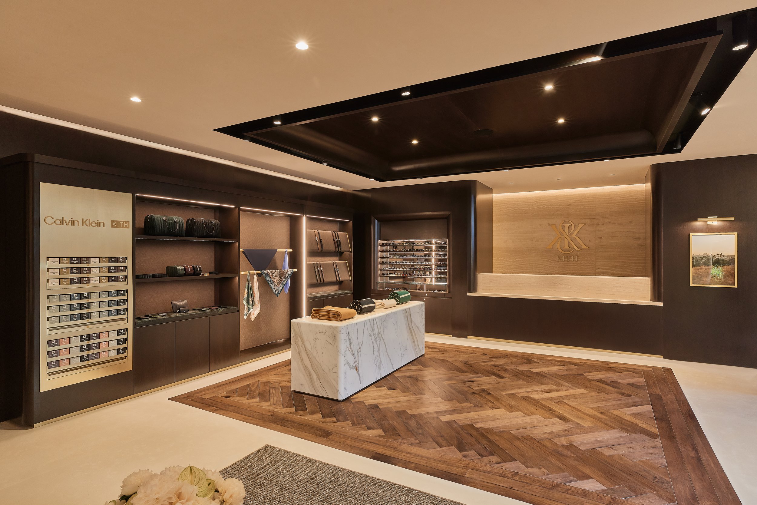
The project is conceived as a continuation of Kith’s evolving spatial language—an environment that adapts the brand’s identity to the distinct character of West Hollywood.
Developed as a renovation of an existing structure, the design repositions the space through a more refined and context-responsive framework. While maintaining continuity with Kith’s broader architectural language, the project introduces a lighter and more open sensibility—reflecting the material and atmospheric qualities associated with Los Angeles. The approach balances consistency with variation, allowing the space to feel both recognizably Kith and specific to its location.
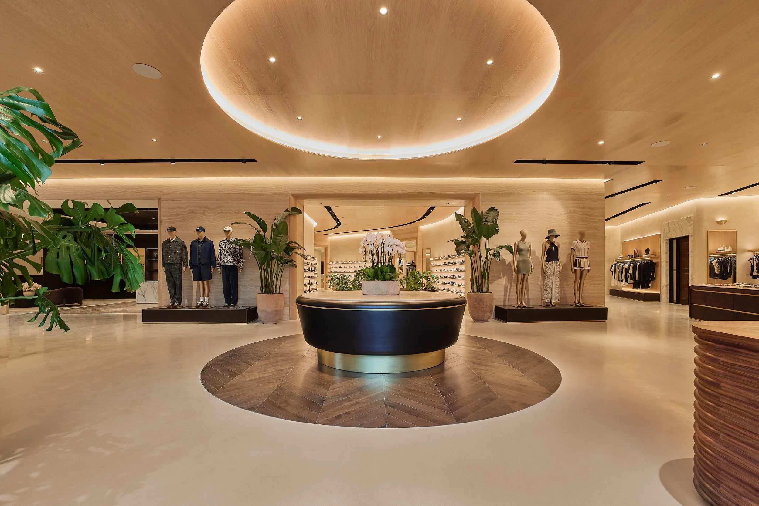
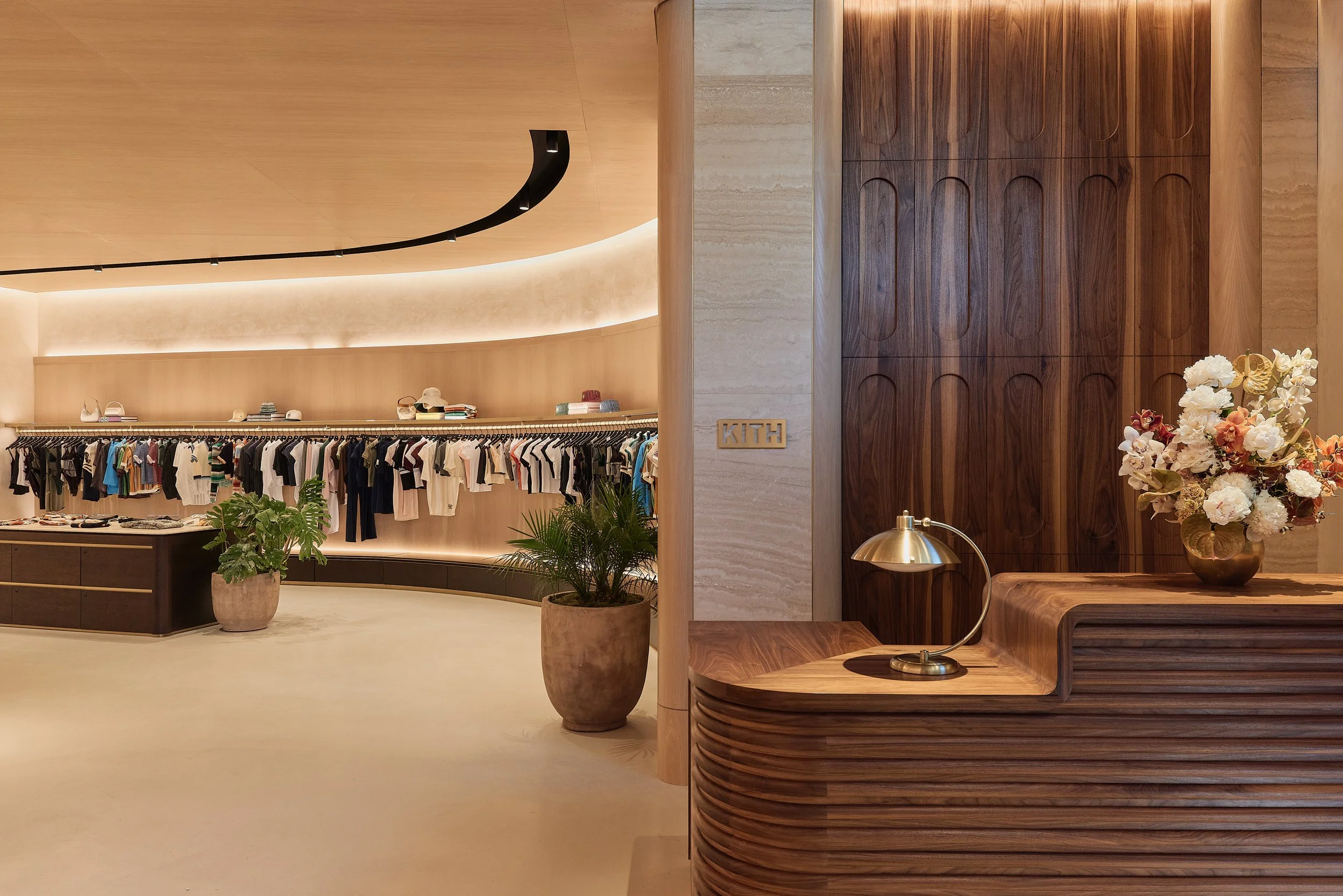
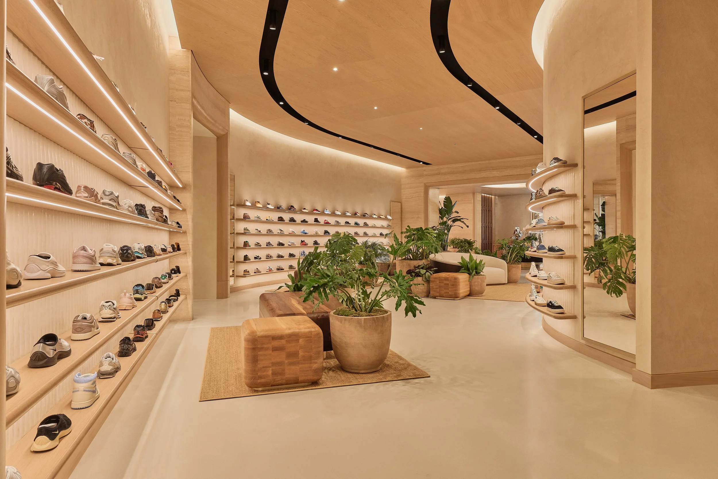
The architecture is composed through a restrained palette, where stone, plaster, wood, and metal are used to establish depth and clarity. Light plays a more active role in shaping the environment, softening transitions and reinforcing a sense of openness throughout the space. Circulation is direct and fluid, supporting a continuous experience that encourages movement while maintaining composure.
Material transitions and spatial sequencing are carefully calibrated to create subtle moments of contrast, allowing the environment to unfold gradually. Display elements are integrated into the architecture, reinforcing a cohesive and controlled framework that allows product and activity to define the visual field.
The result is an environment that extends Kith’s presence into a new context—one that is both consistent and adaptive. The project operates as part of a broader system while responding to its surroundings, creating a space that is built to perform, and to communicate.
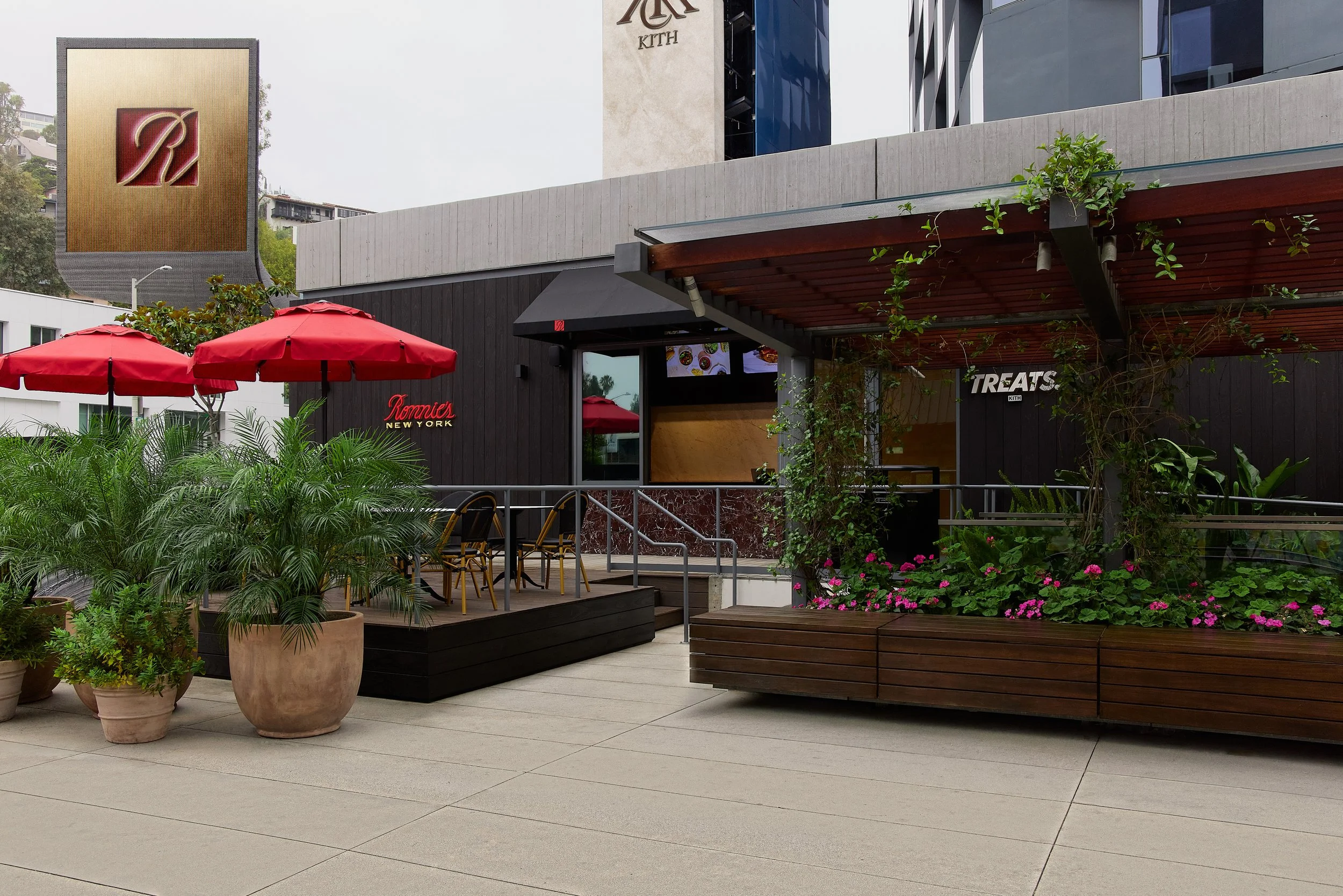
Ronnie’s New York
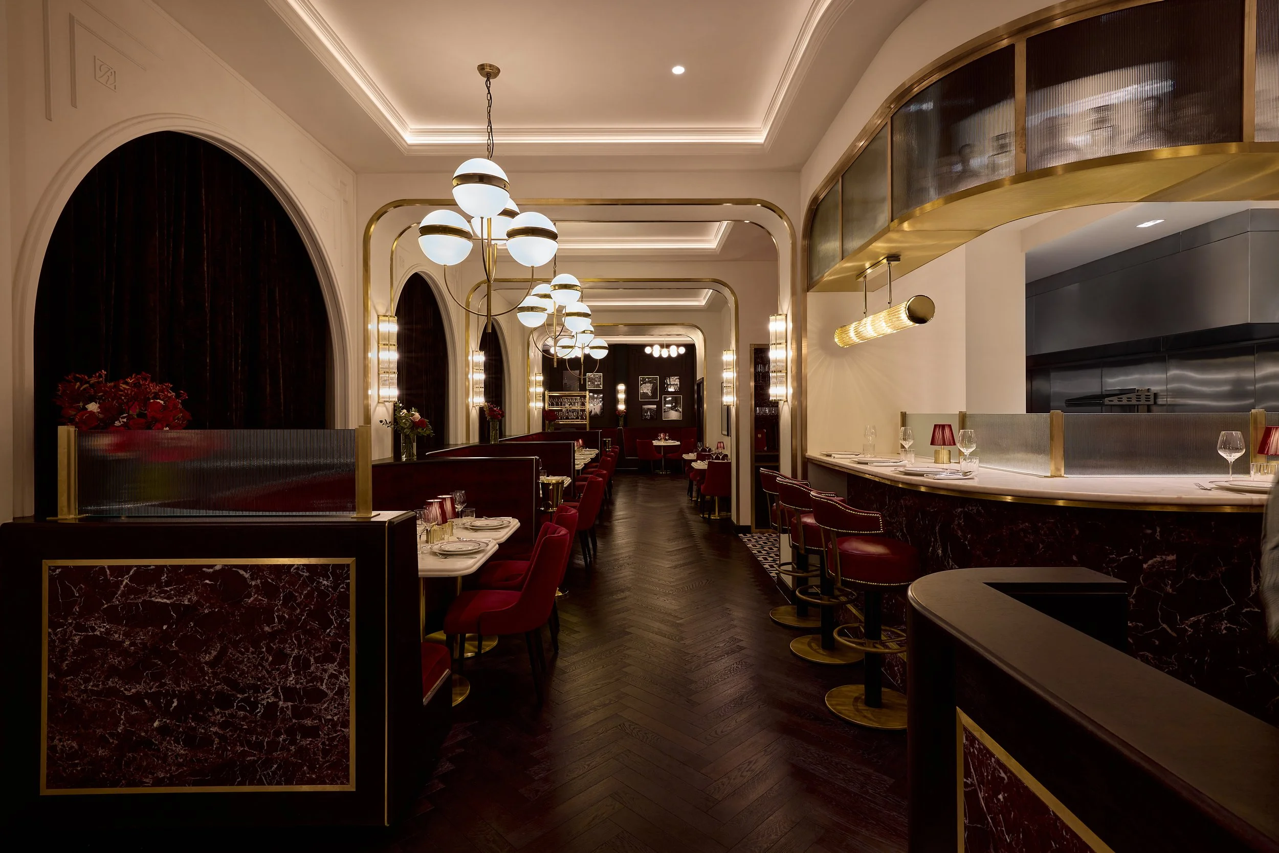
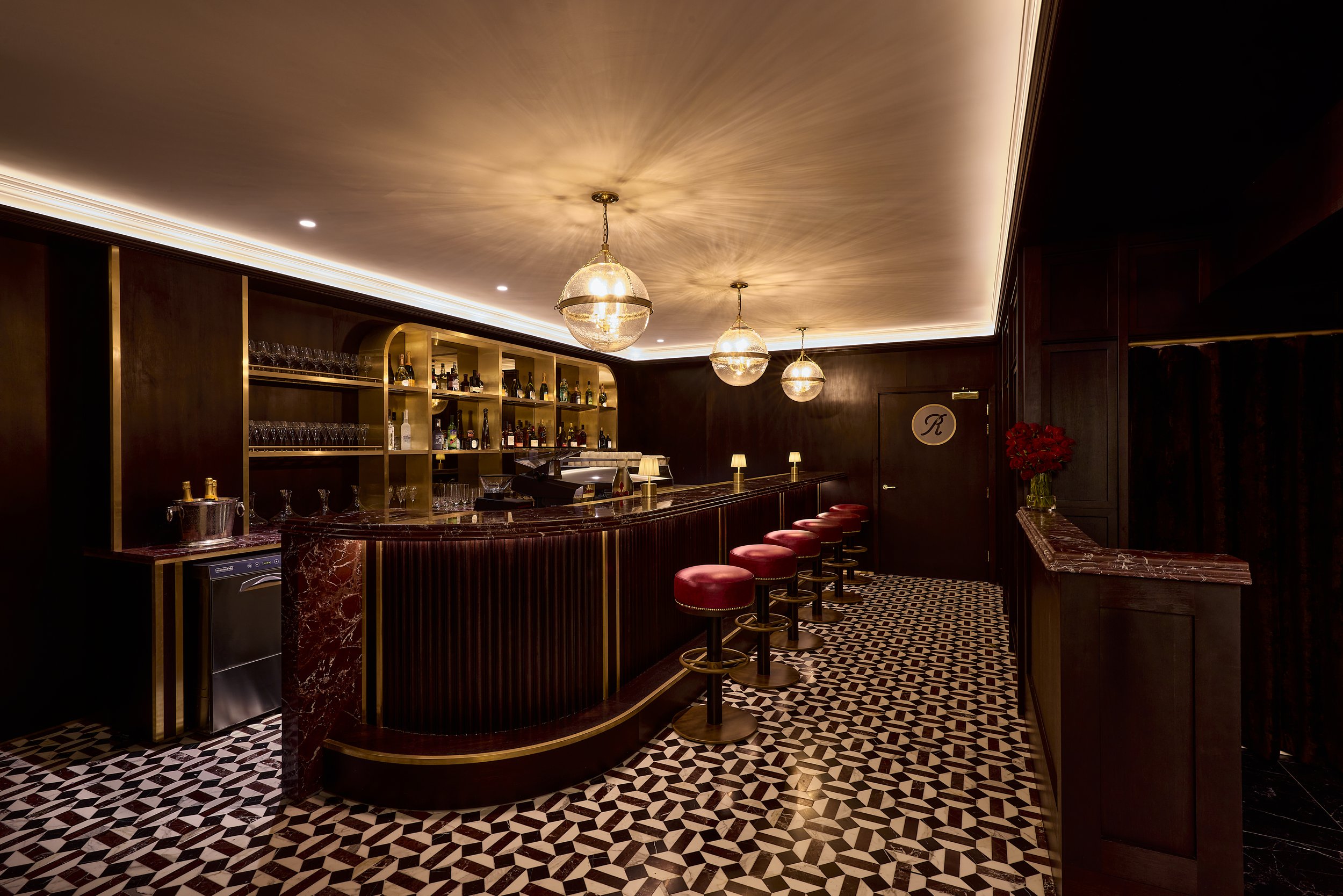
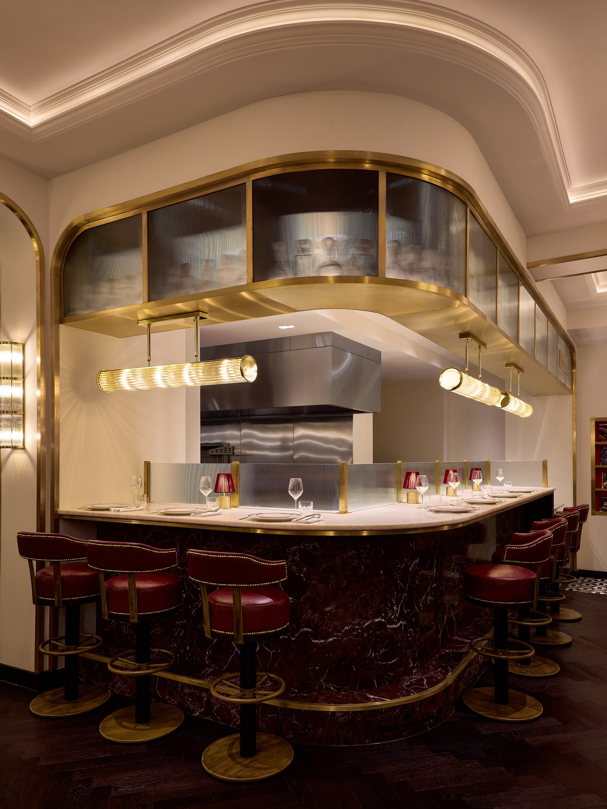
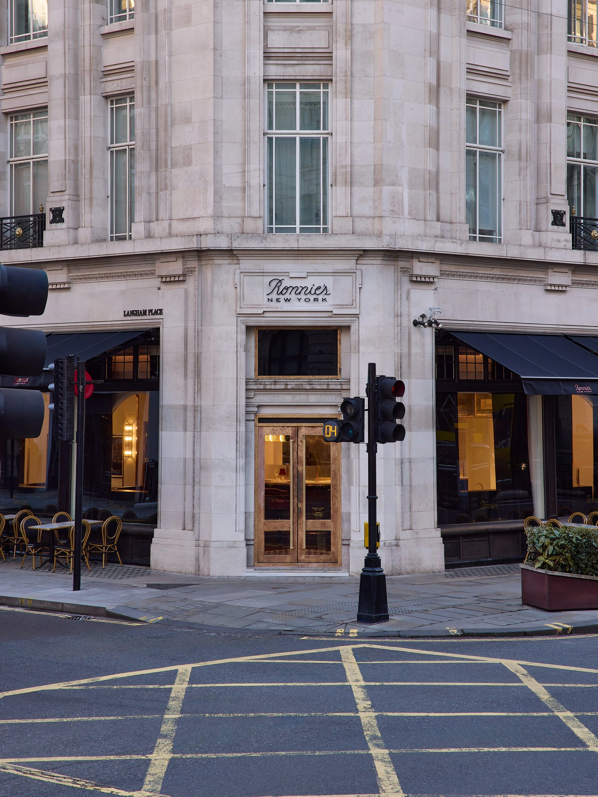
Restaurant
London, England
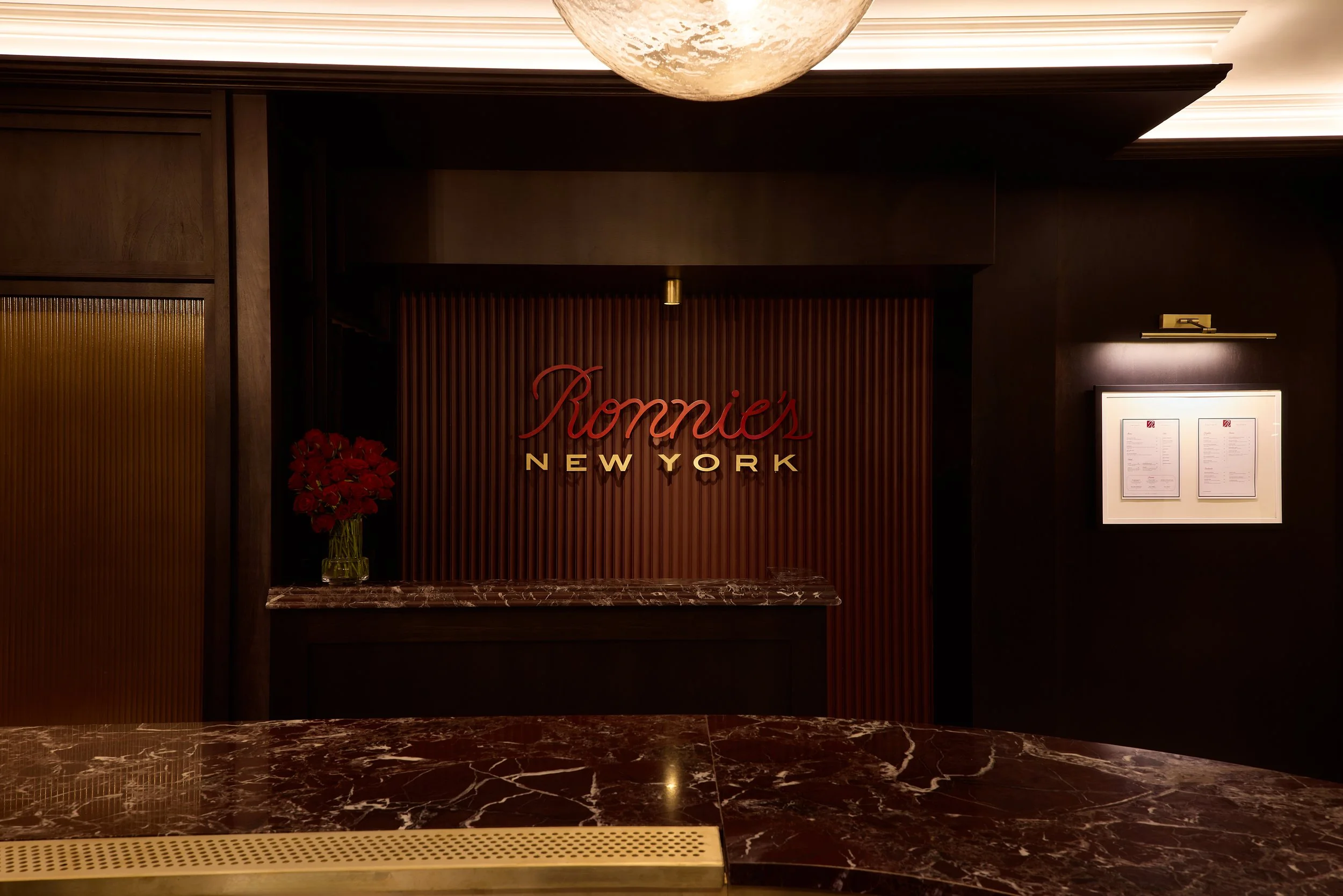
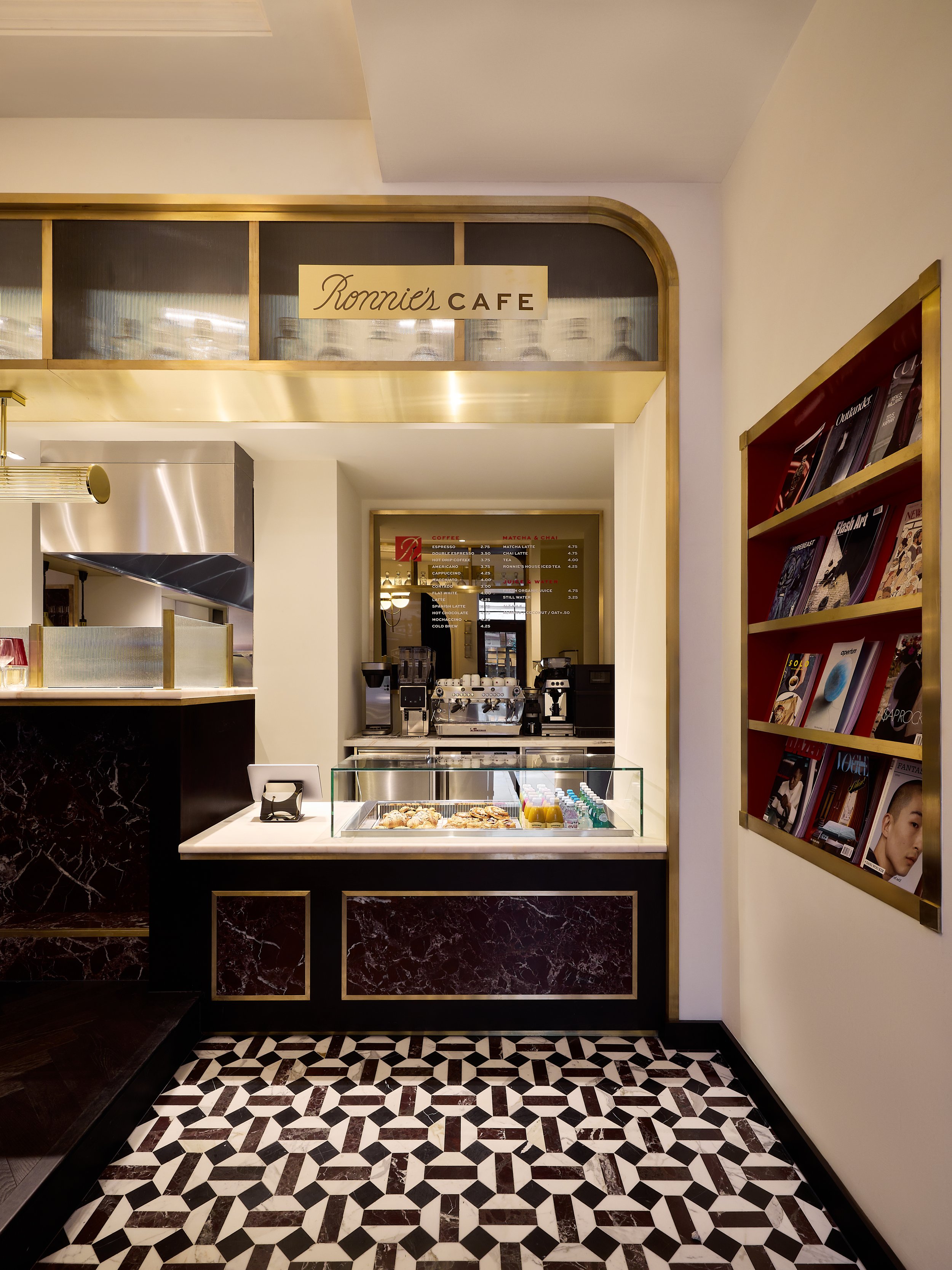
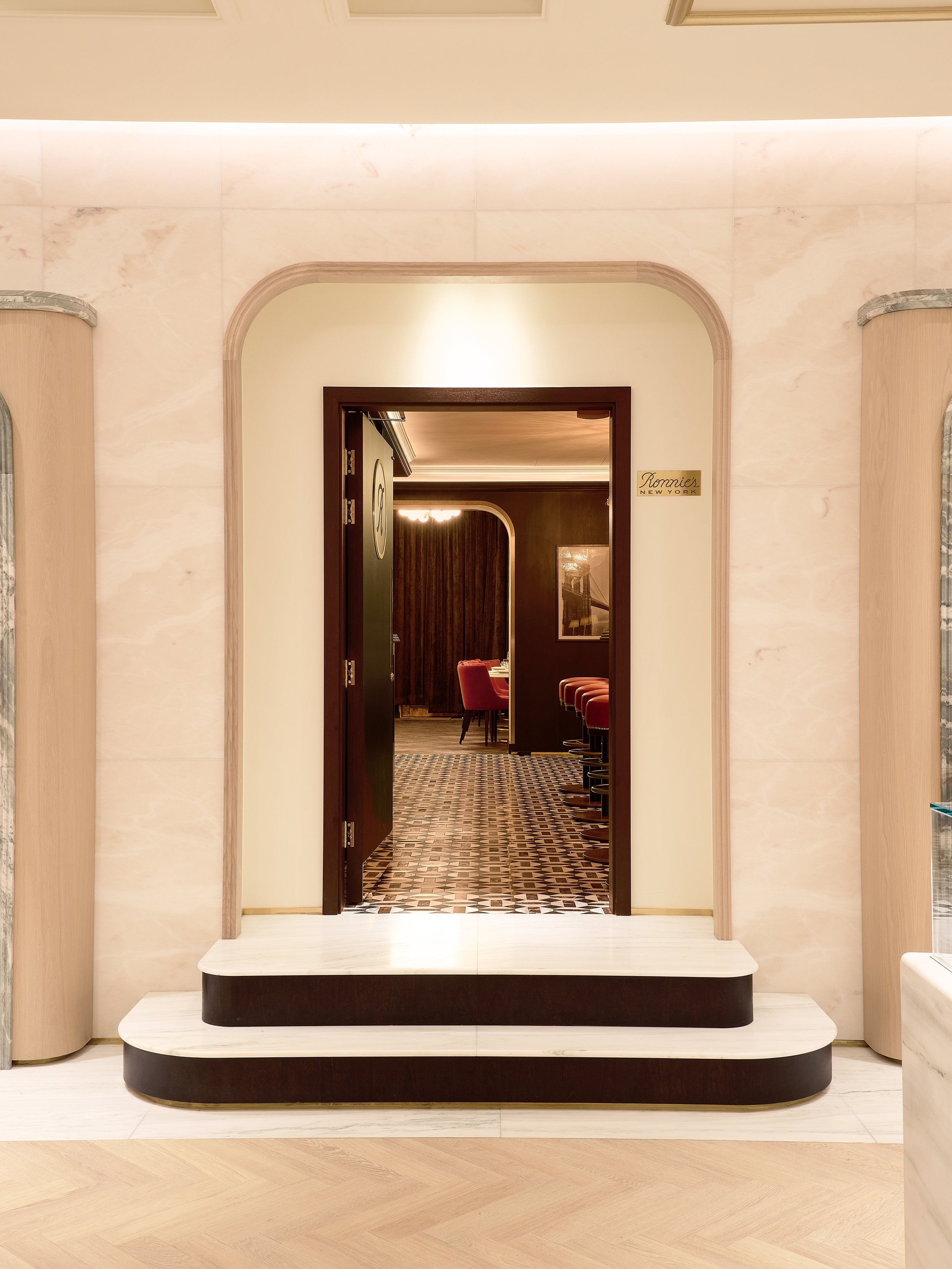
Ronnie’s New York is a personal extension of Ronnie Fieg—an environment that translates his relationship to New York into a spatial and material experience.
Developed as a restaurant rooted in memory, culture, and routine, the space draws from the character of New York dining institutions while avoiding direct reference. Rather than recreating familiar typologies, the design distills their underlying qualities—intimacy, material richness, and a sense of permanence—into a more controlled and contemporary framework. The result is an environment that feels at once recognizable and specific, shaped by both personal narrative and collective memory.
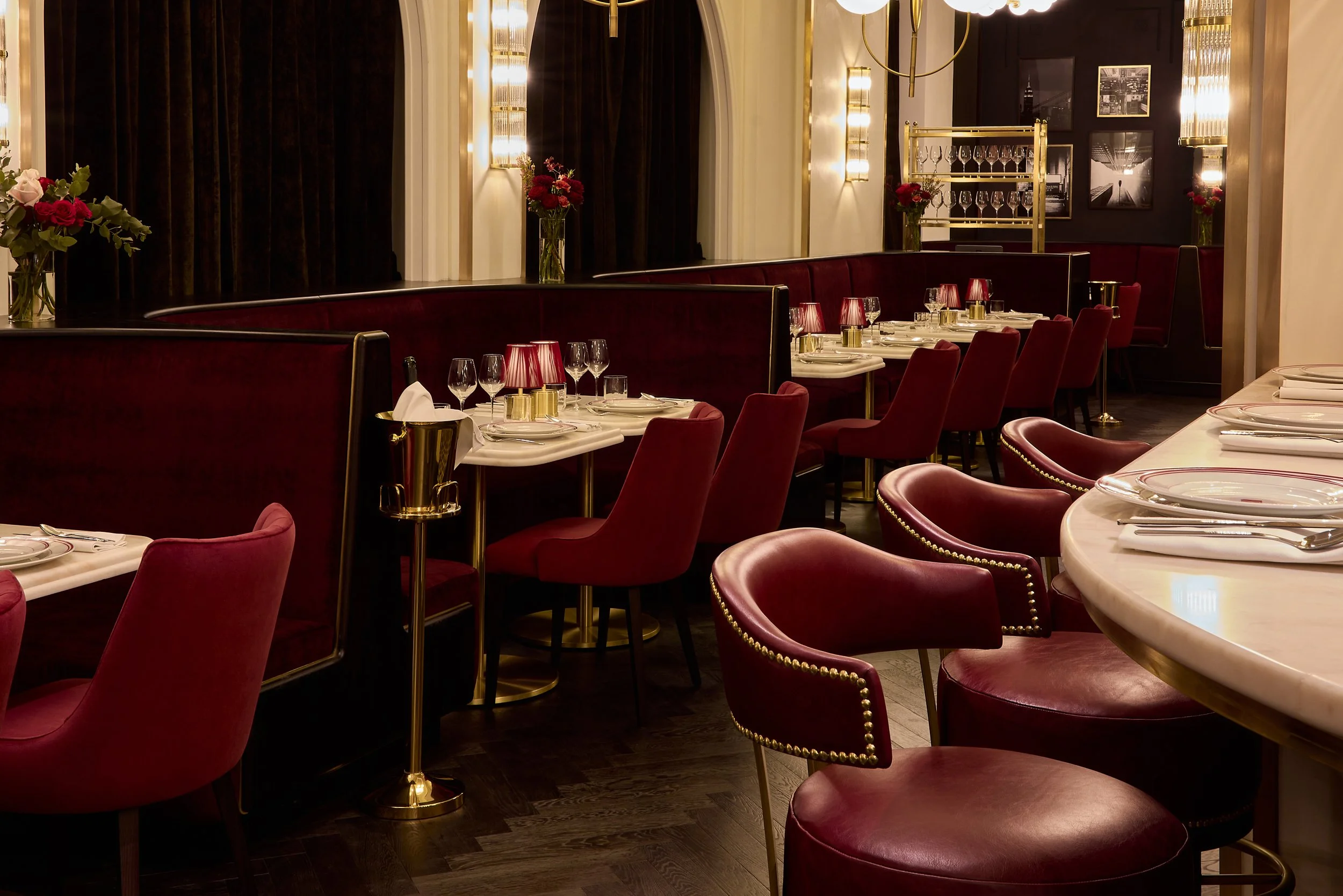
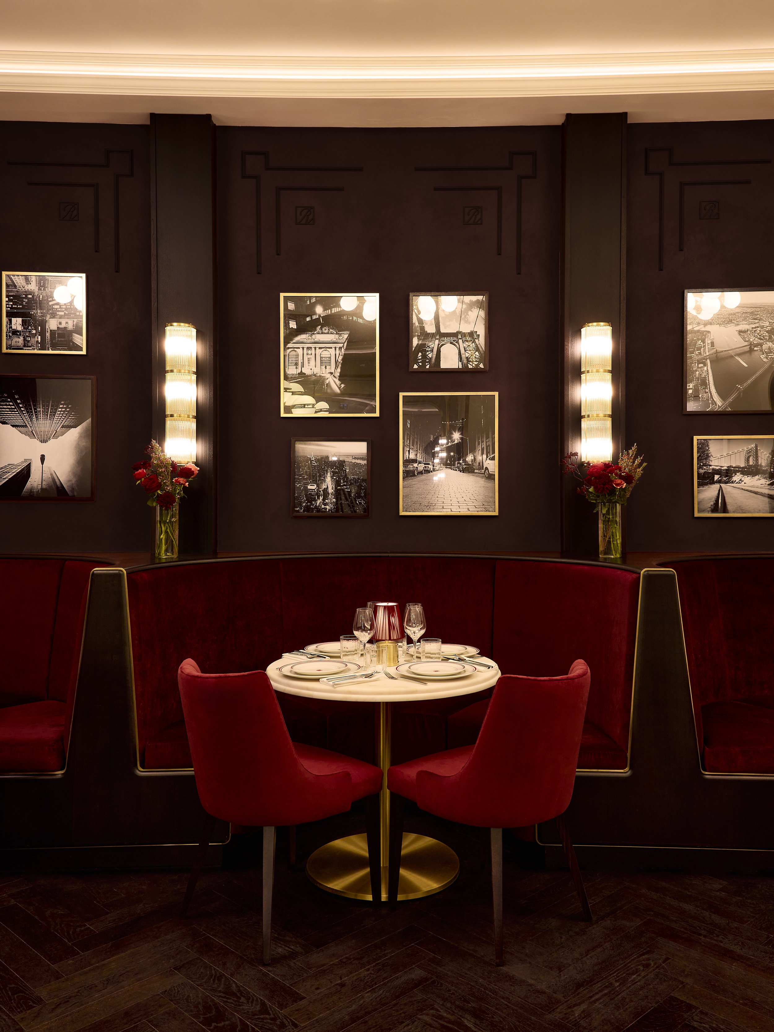
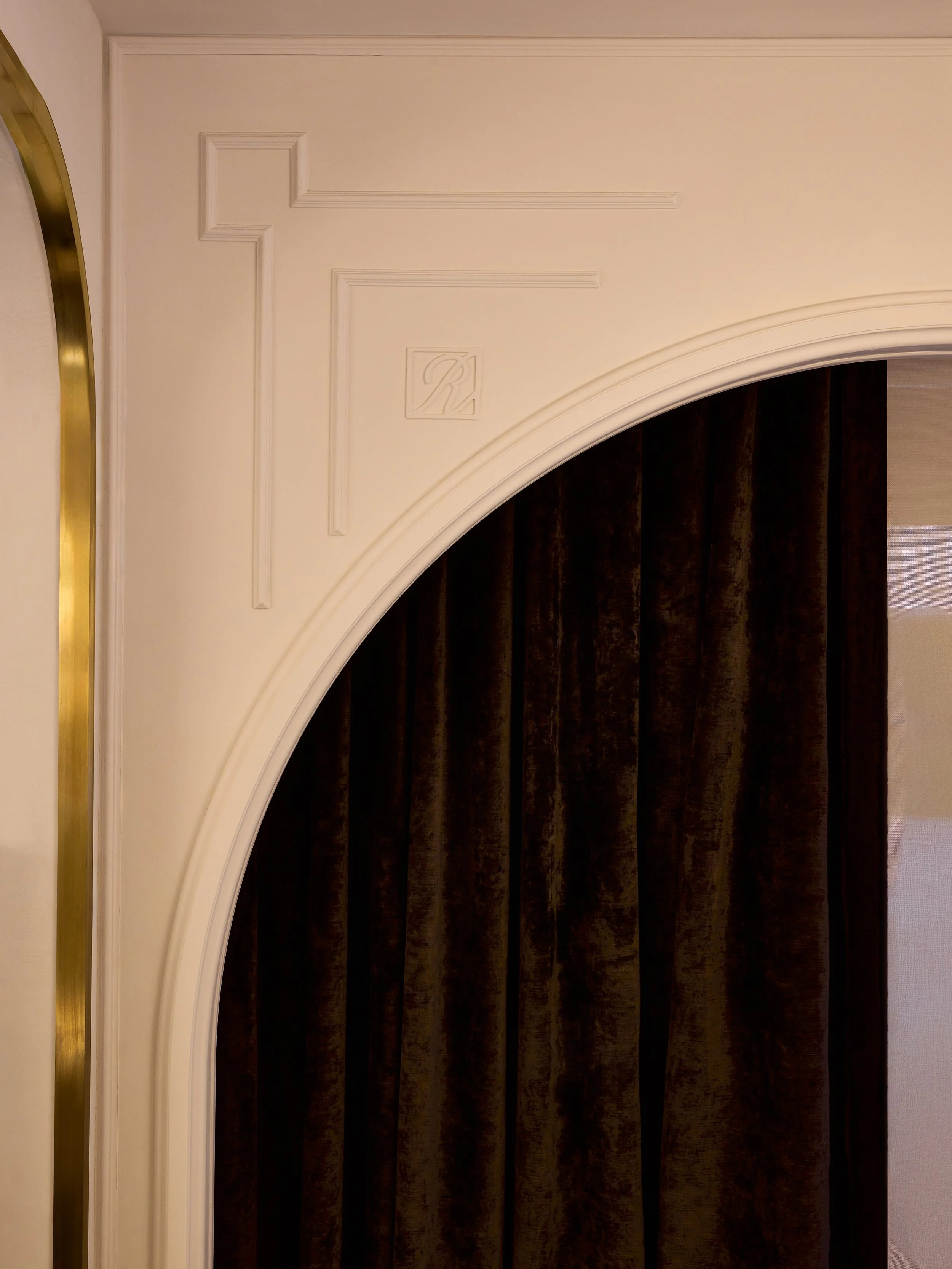
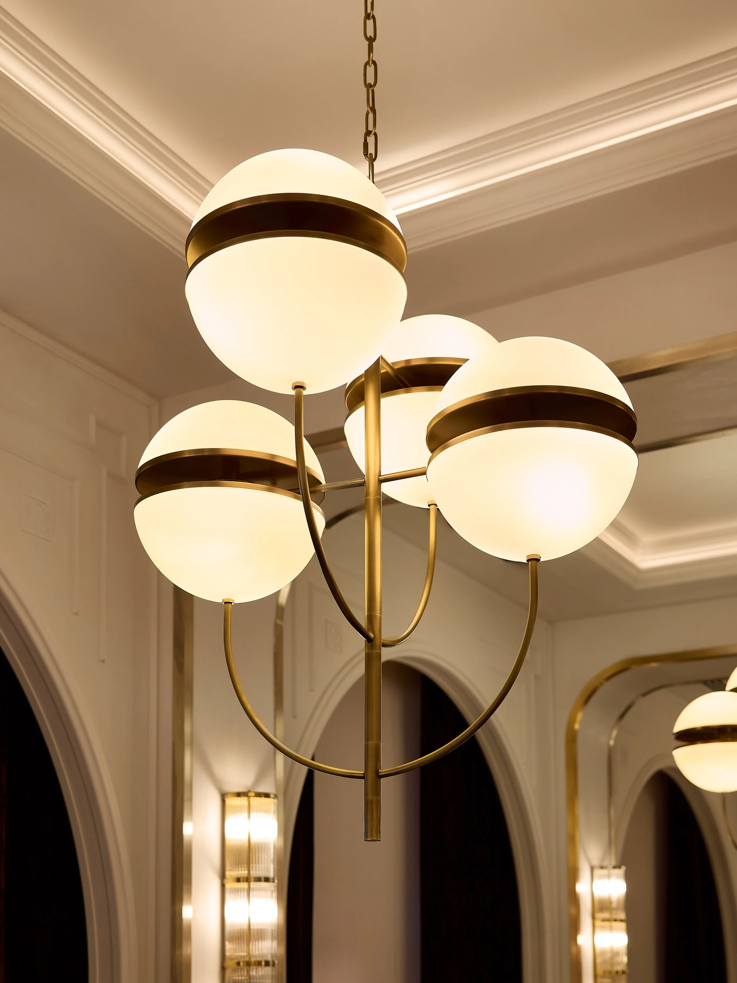
The architecture is composed through a restrained and tactile palette. Stone, wood, and metal are used to establish depth and durability, while lighting is calibrated to create a warm and consistent atmosphere throughout the space. Proportion and enclosure are carefully balanced, allowing the restaurant to shift between openness and privacy, supporting both individual and communal dining experiences.
Circulation is direct but measured, guiding movement without emphasis. Seating, bar, and service elements are integrated into a cohesive spatial system, reinforcing a sense of continuity and clarity. The environment is designed to hold activity rather than compete with it—allowing food, conversation, and occupation to define the space over time.
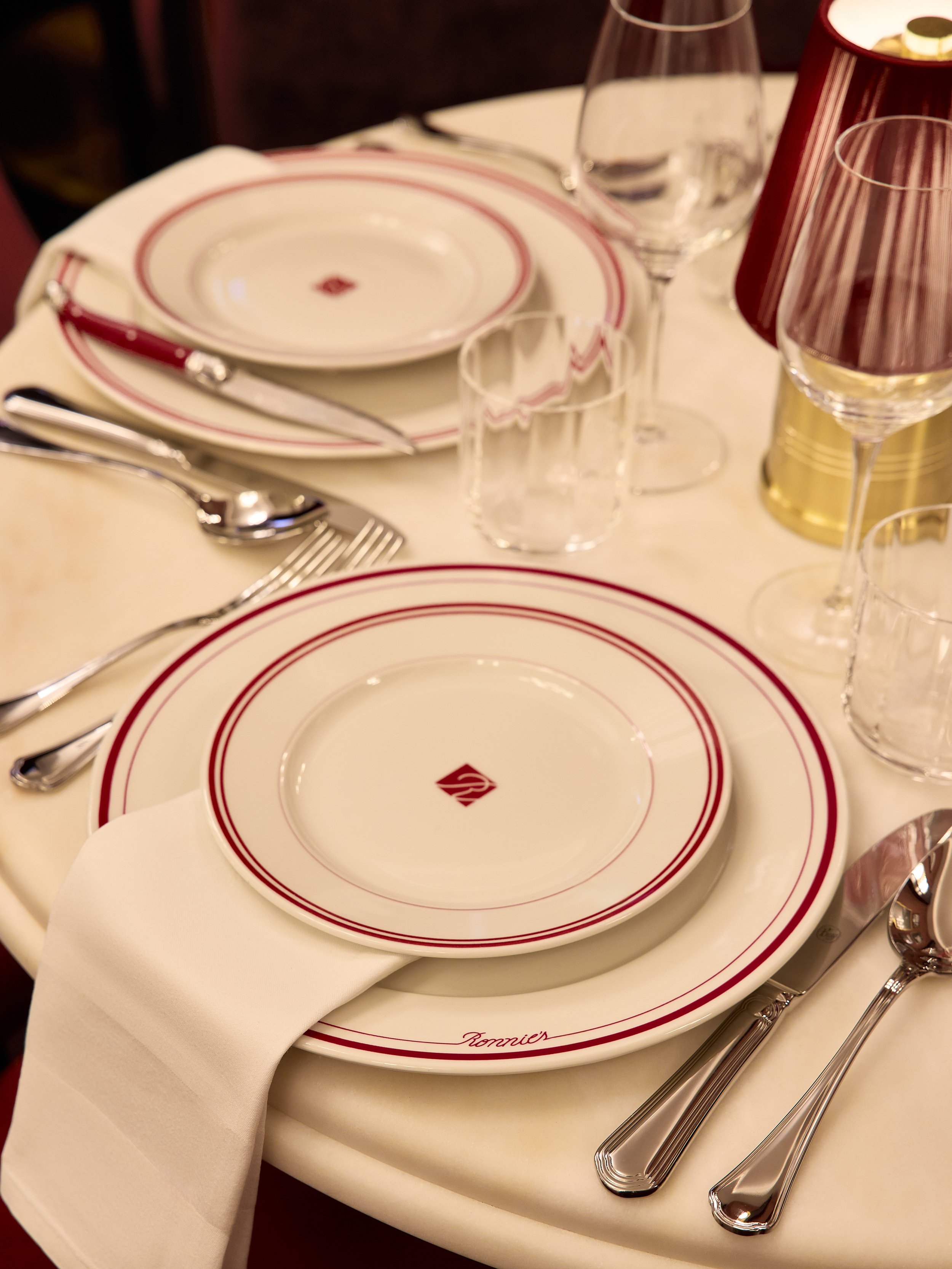
The result is an architecture that reflects a distinctly New York sensibility—grounded, composed, and enduring. The restaurant operates not only as a place to dine, but as a setting shaped by identity and experience, built to perform, and to communicate.
Rimowa Madison Ave
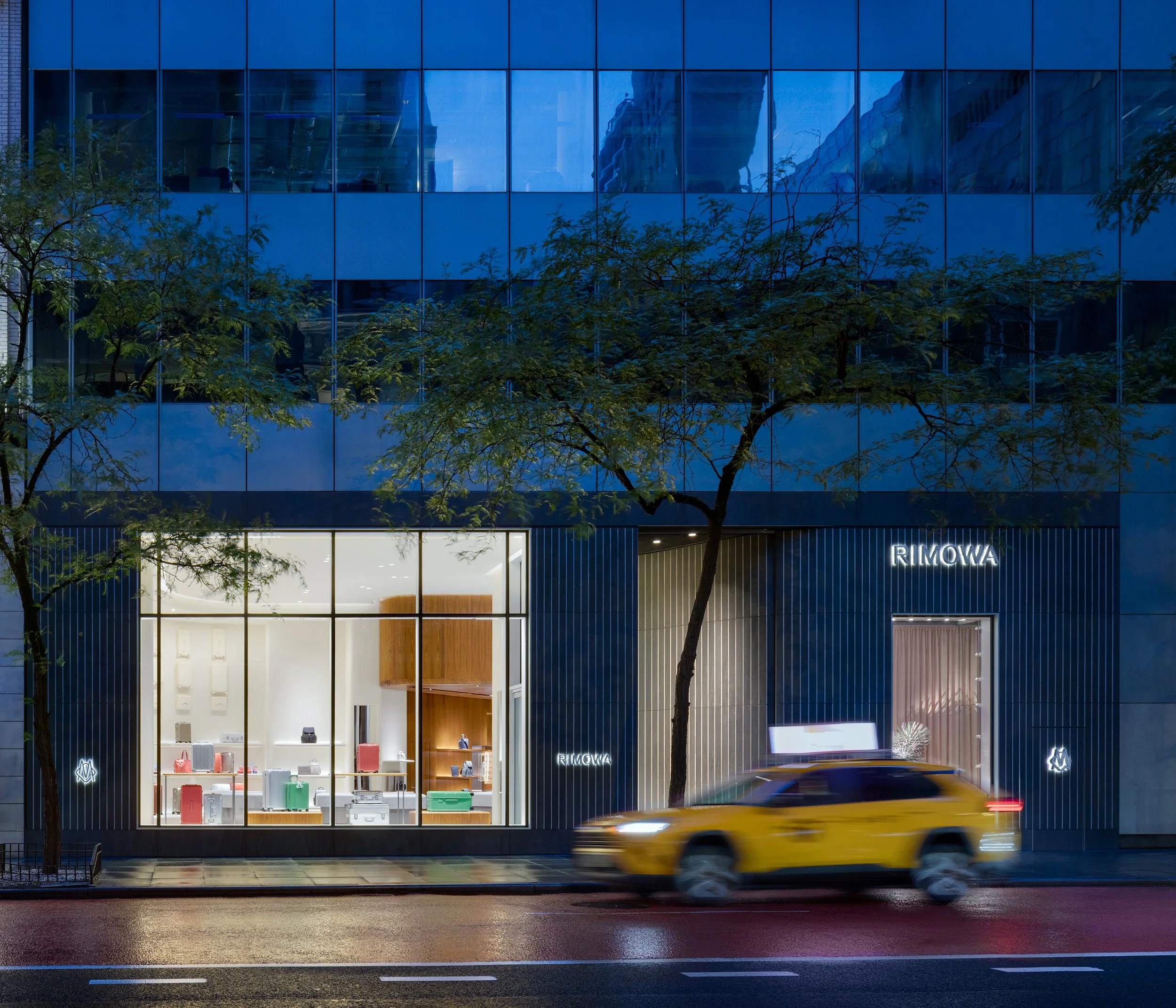
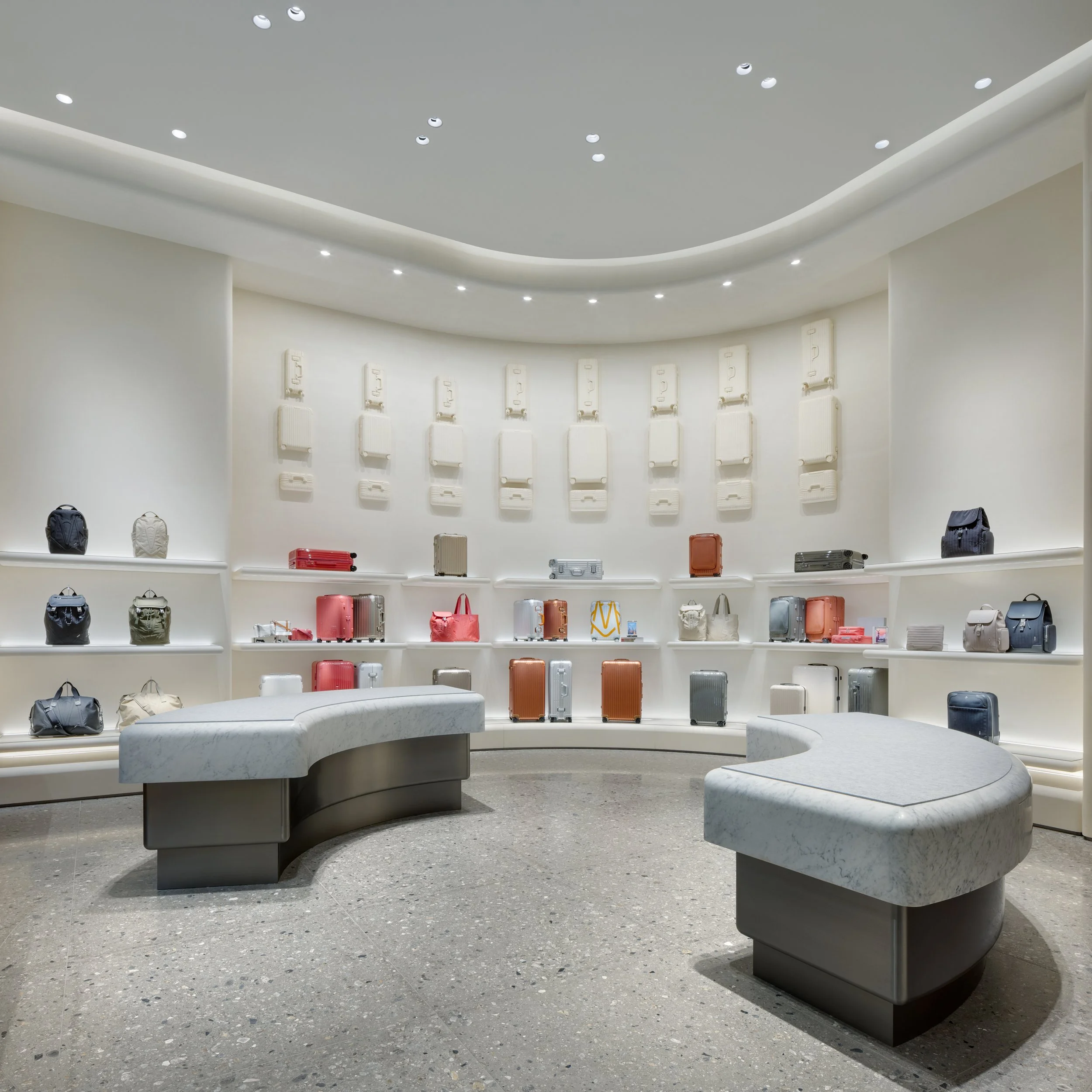
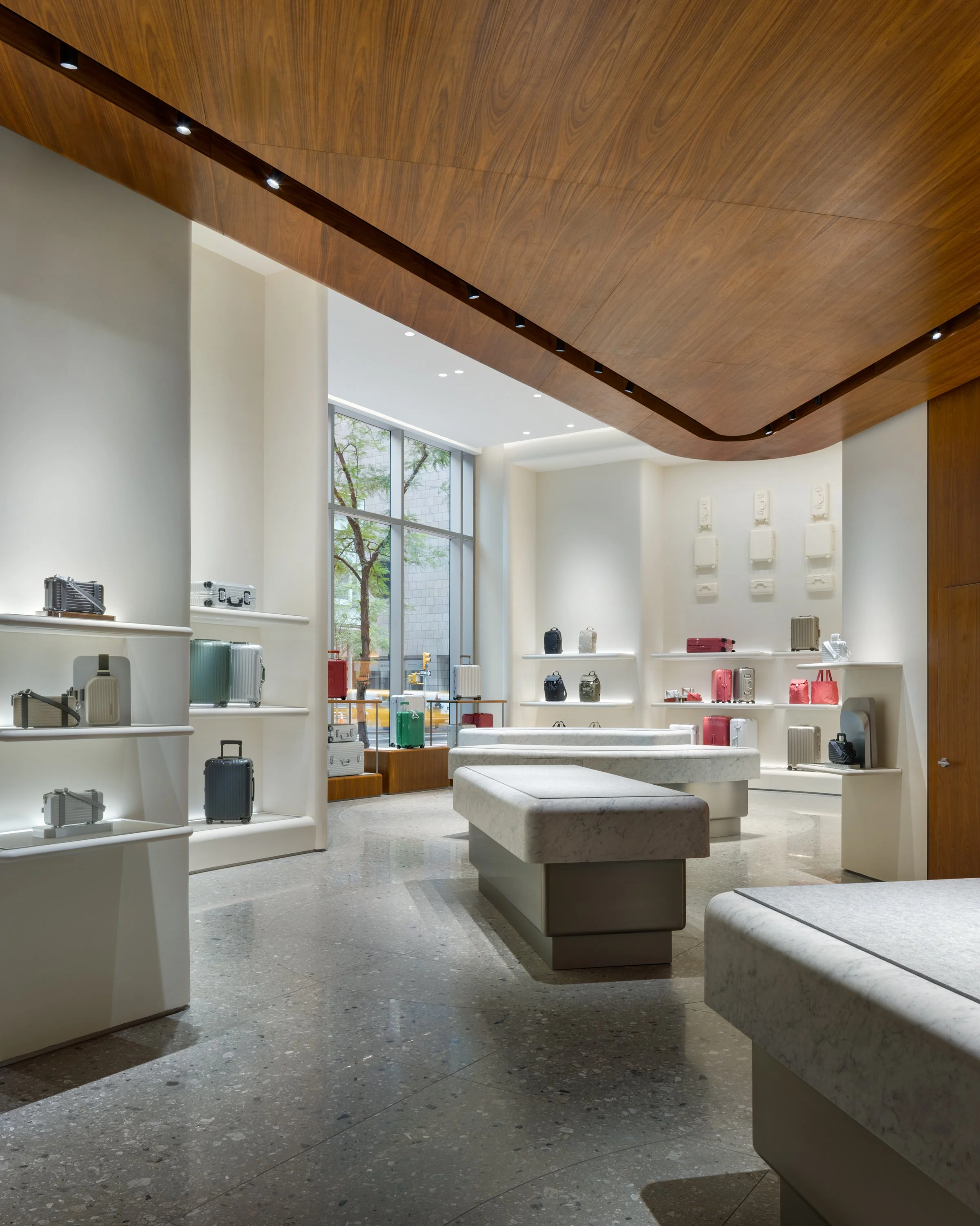


Fashion Retail
Global Flagships
New York City
This store is a recalibration of Rimowa’s spatial identity—an environment that returns focus to the product through a more reduced and precise architectural language.
Developed for the Madison Avenue flagship—its highest-performing global location—the design reconsiders the brand’s typical retail expression. Rather than emphasizing surface articulation and integrated lighting, the approach draws from Rimowa’s origins within early modern European design, where clarity, proportion, and material discipline define the space. The architecture is conceived as a quiet framework, allowing the product to register with greater presence and legibility.
The material palette is intentionally restrained—stone, plaster, metal, and wood—composed to create depth without distraction. Lighting is softened and controlled, supporting visibility without becoming a focal element. At the street, the facade operates with equal precision: a reoriented entry, rotated from the primary axis, creates a measured pull from the sidewalk, guiding movement into the space through a subtle but deliberate shift in alignment.
The result is an environment that prioritizes clarity over expression—one that allows the product to lead while reinforcing the discipline and legacy embedded in the brand. The flagship operates as a refined spatial counterpart to Rimowa’s objects: precise, controlled, and built to perform, and to communicate.
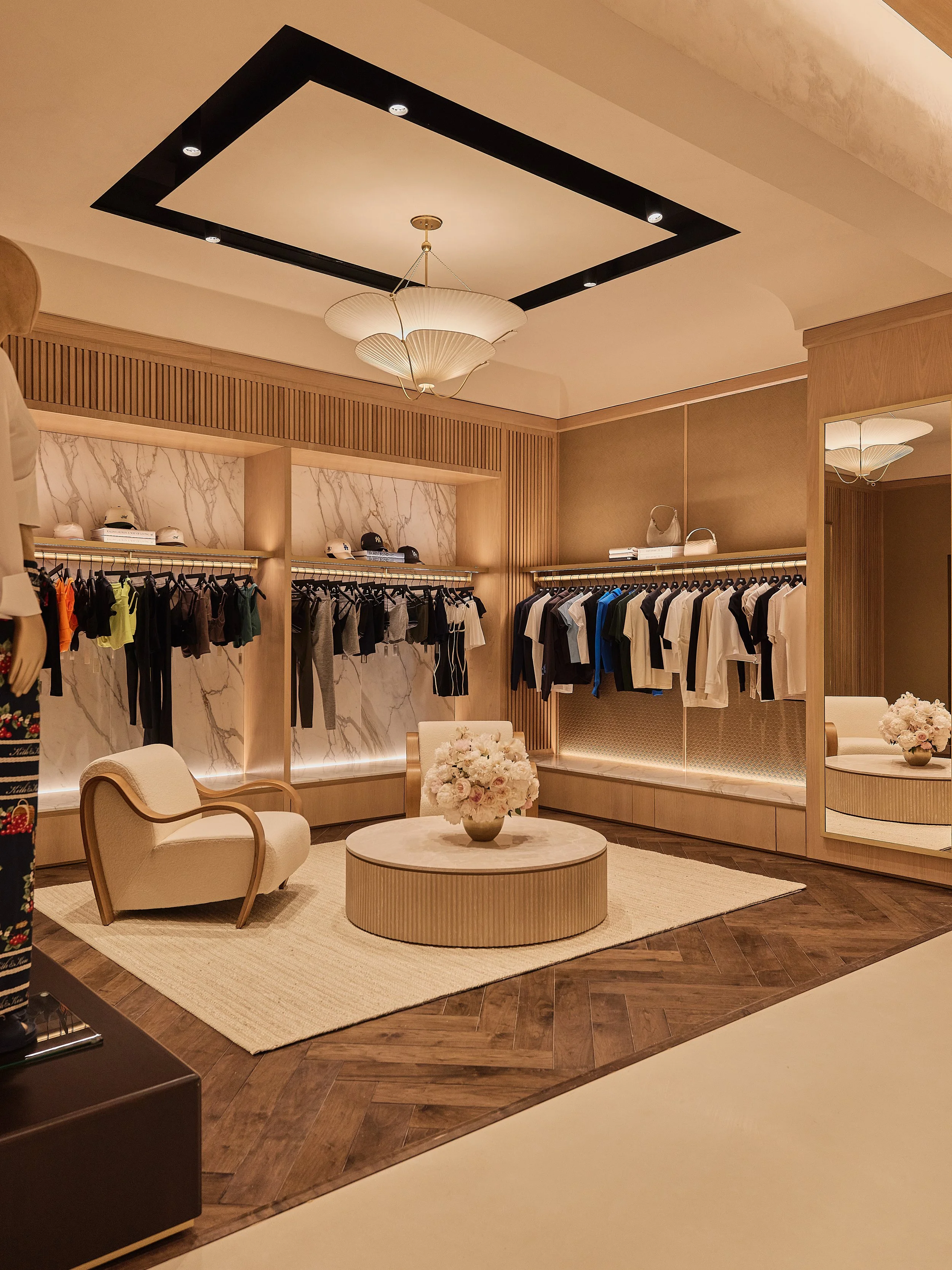
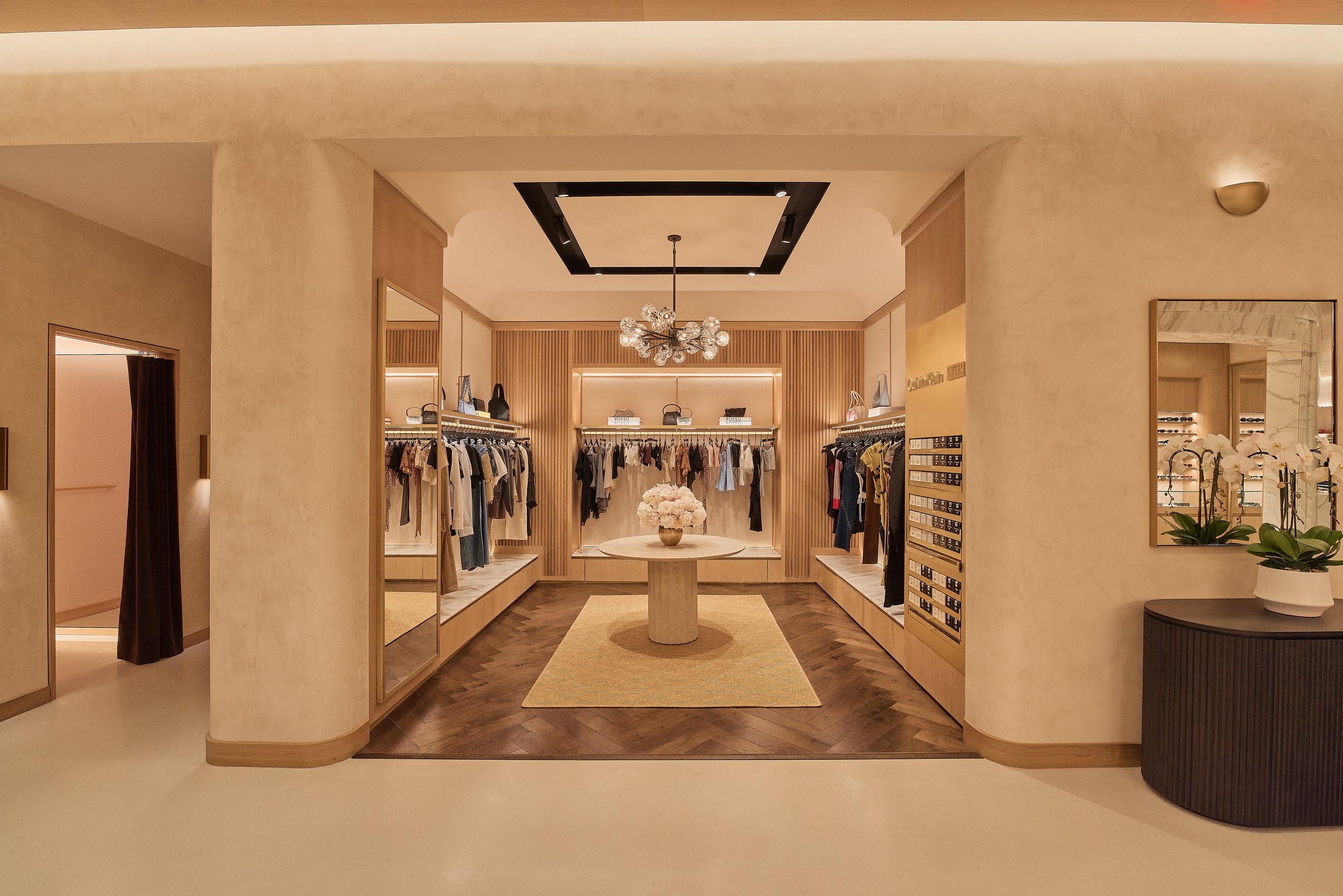
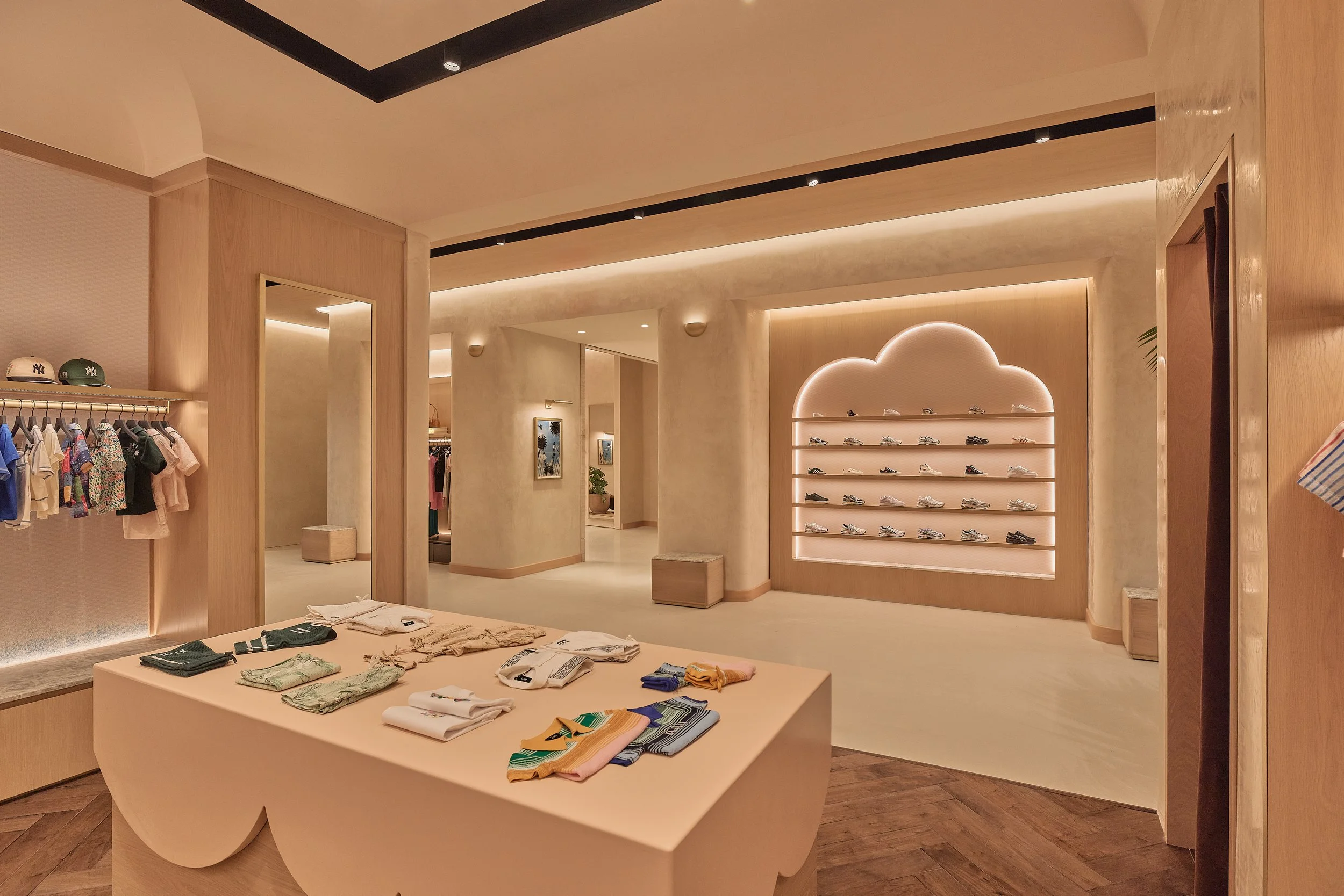
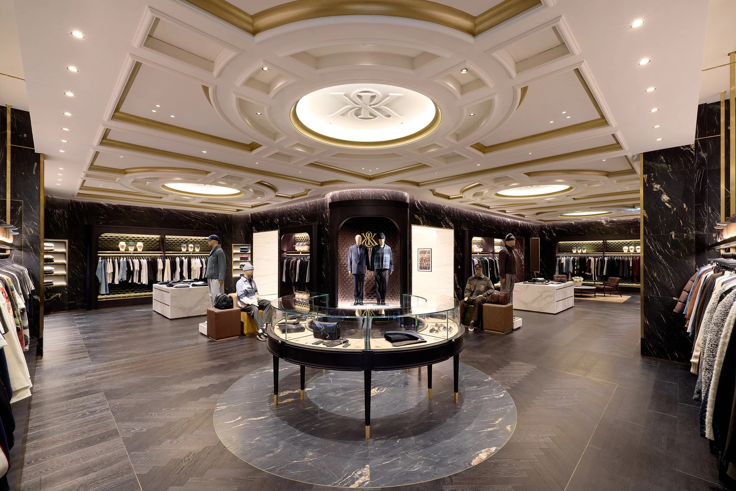
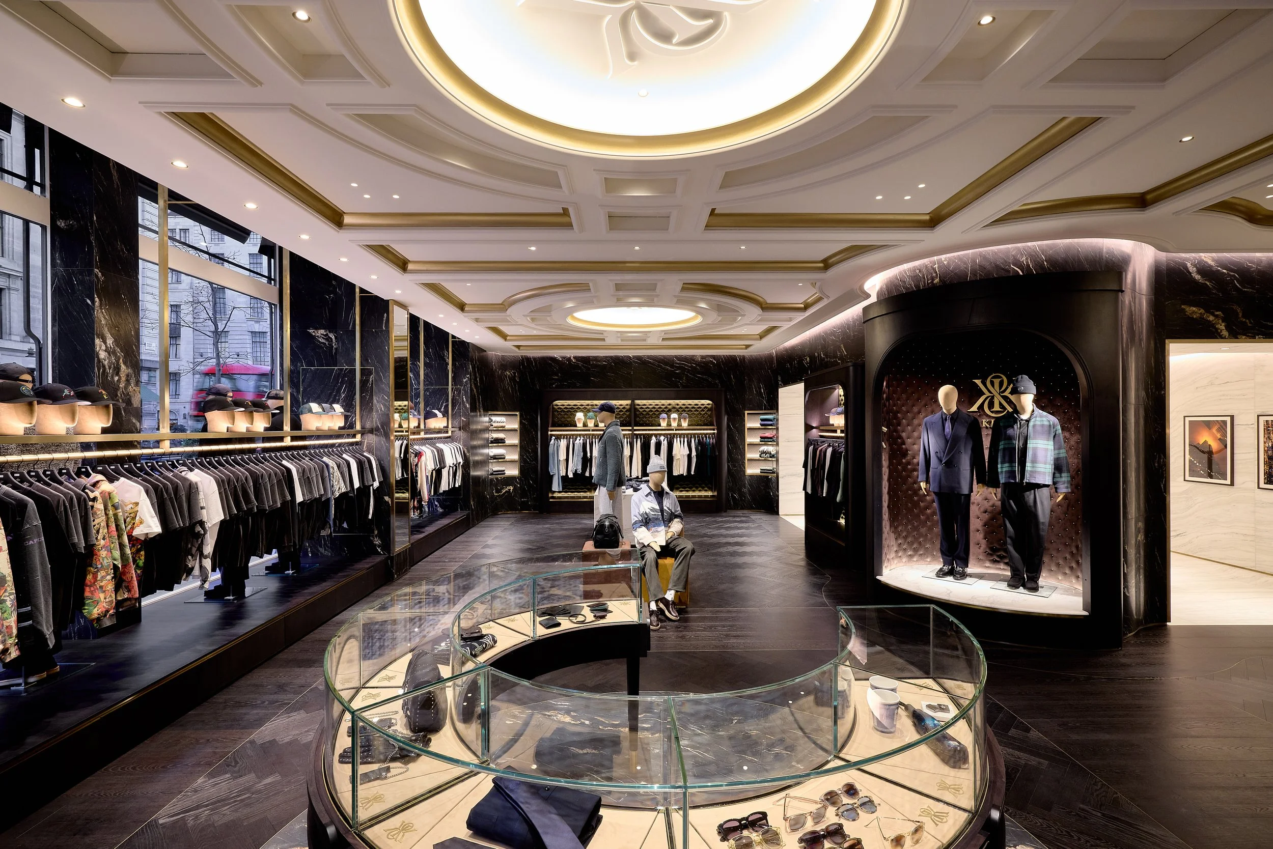
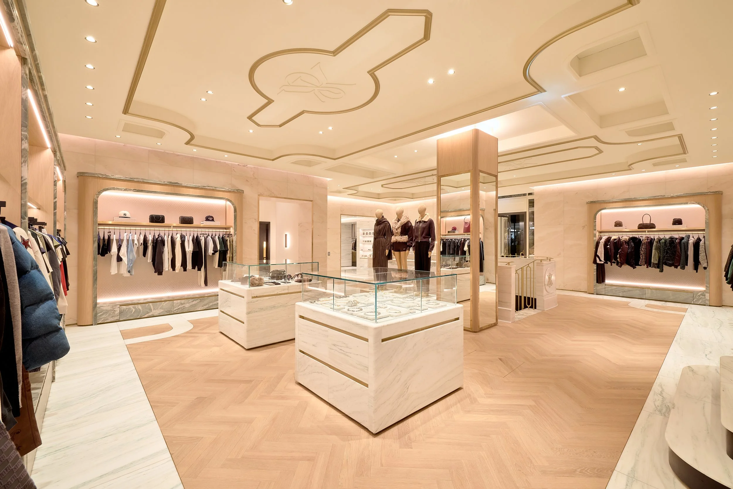
Kith
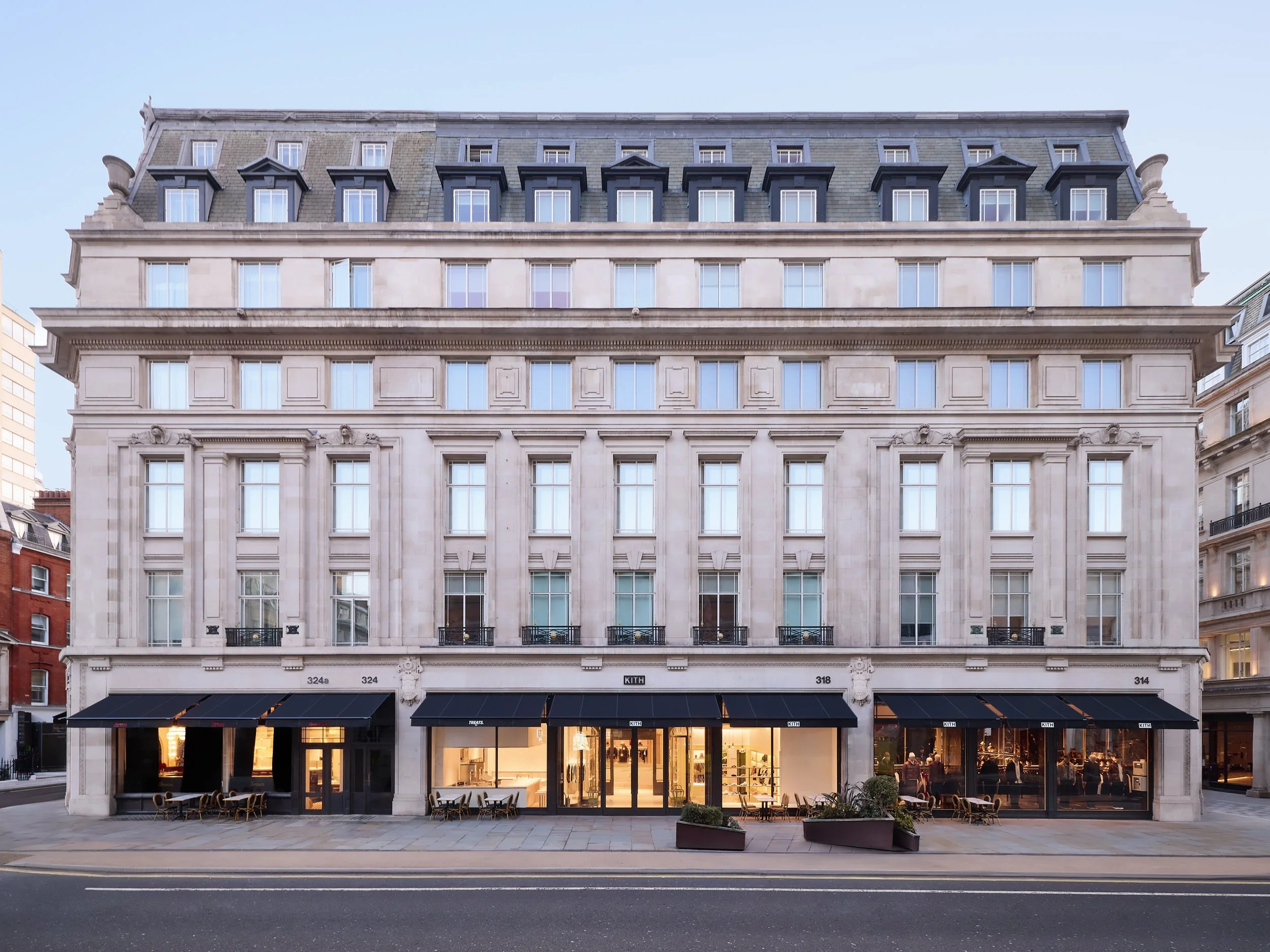
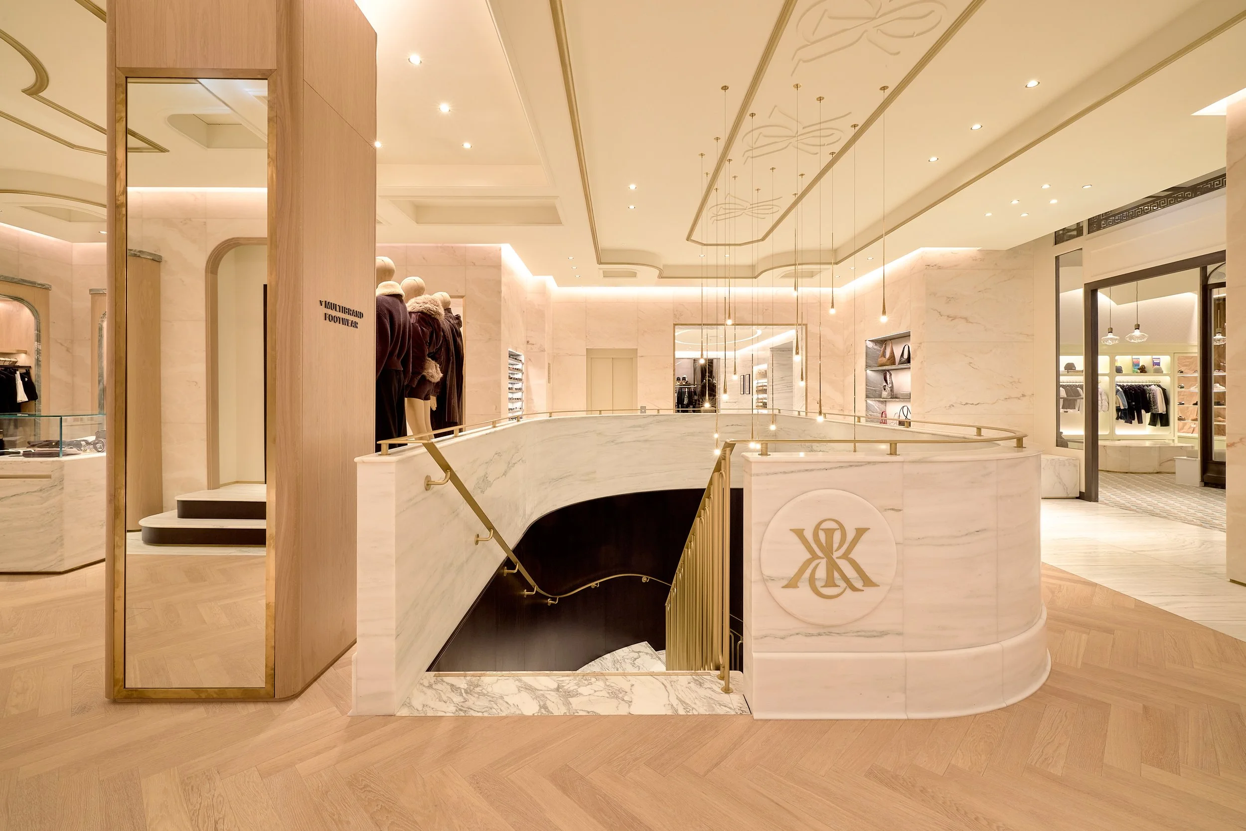
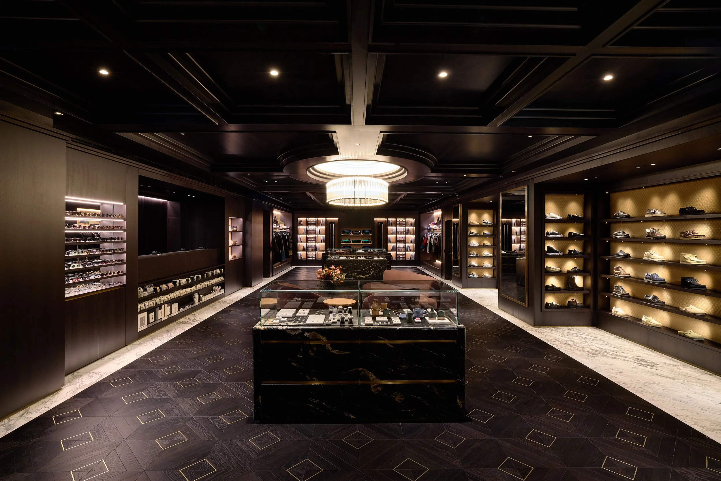
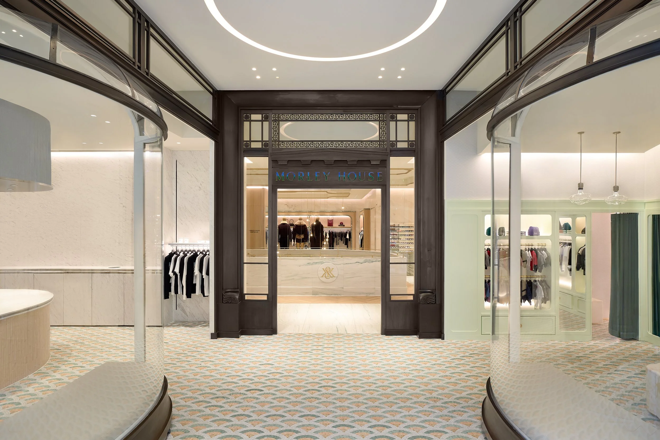
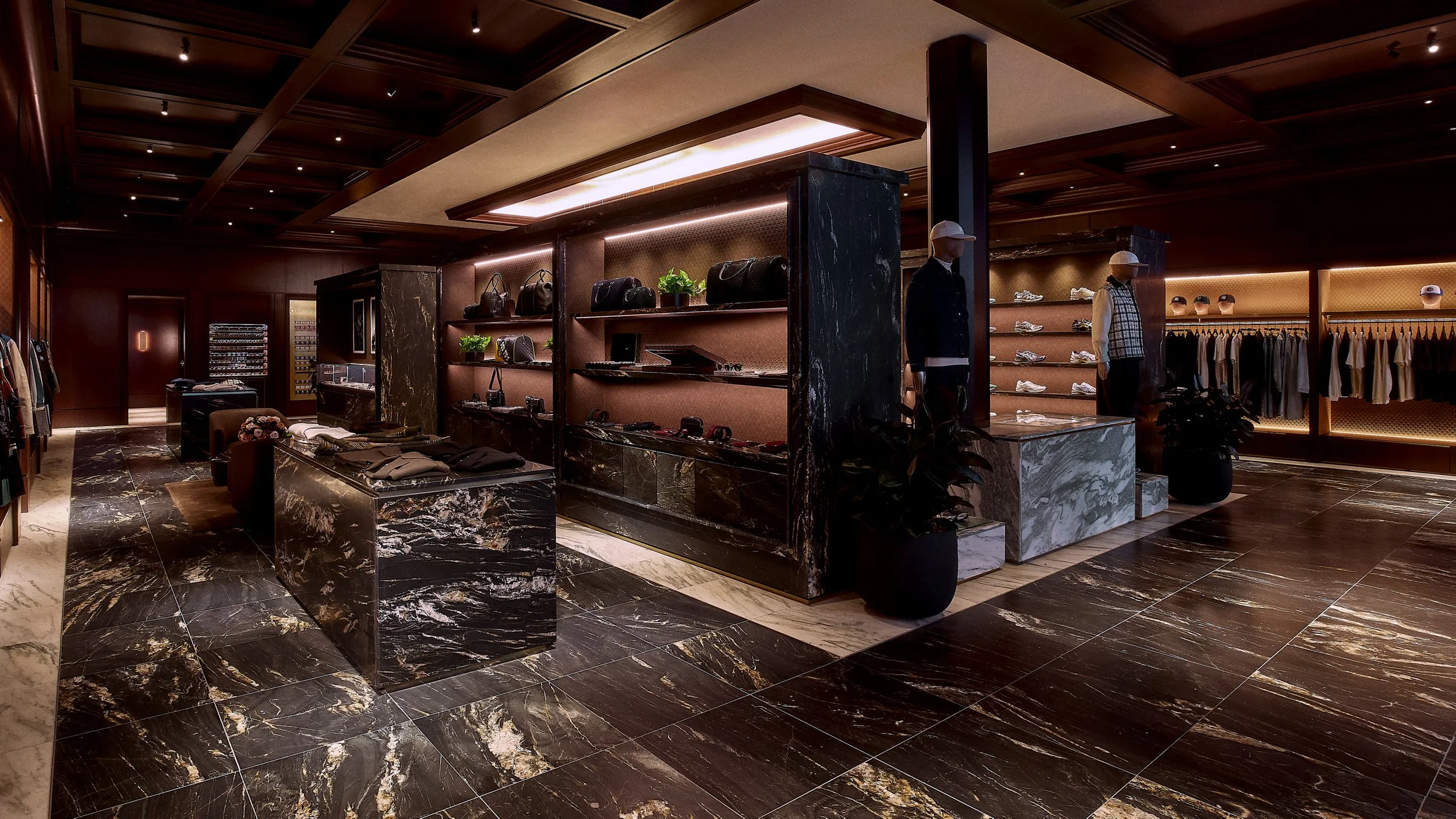
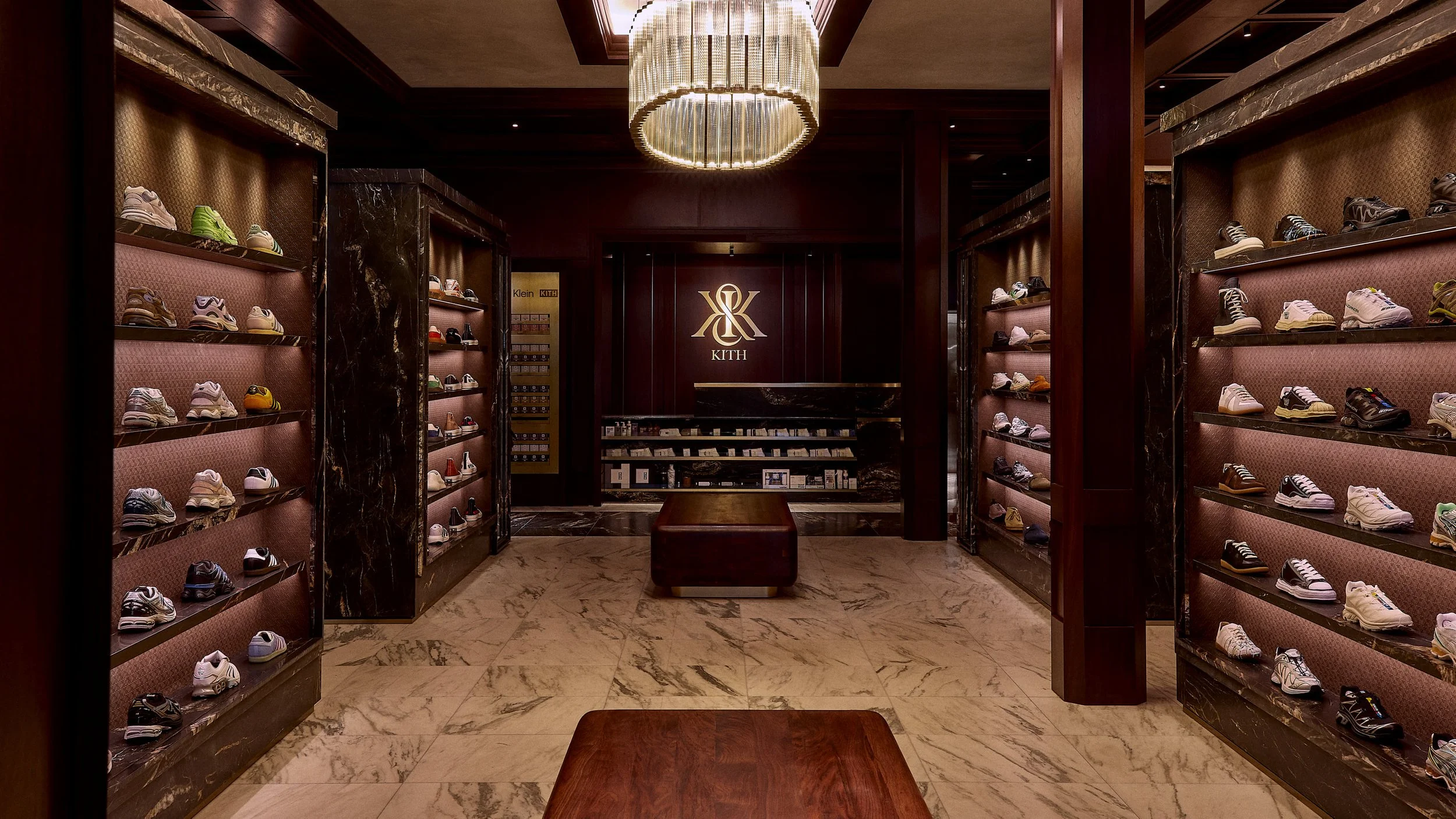
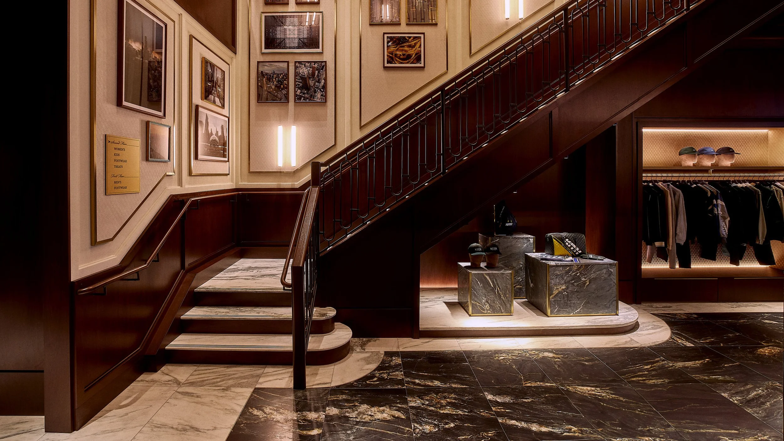
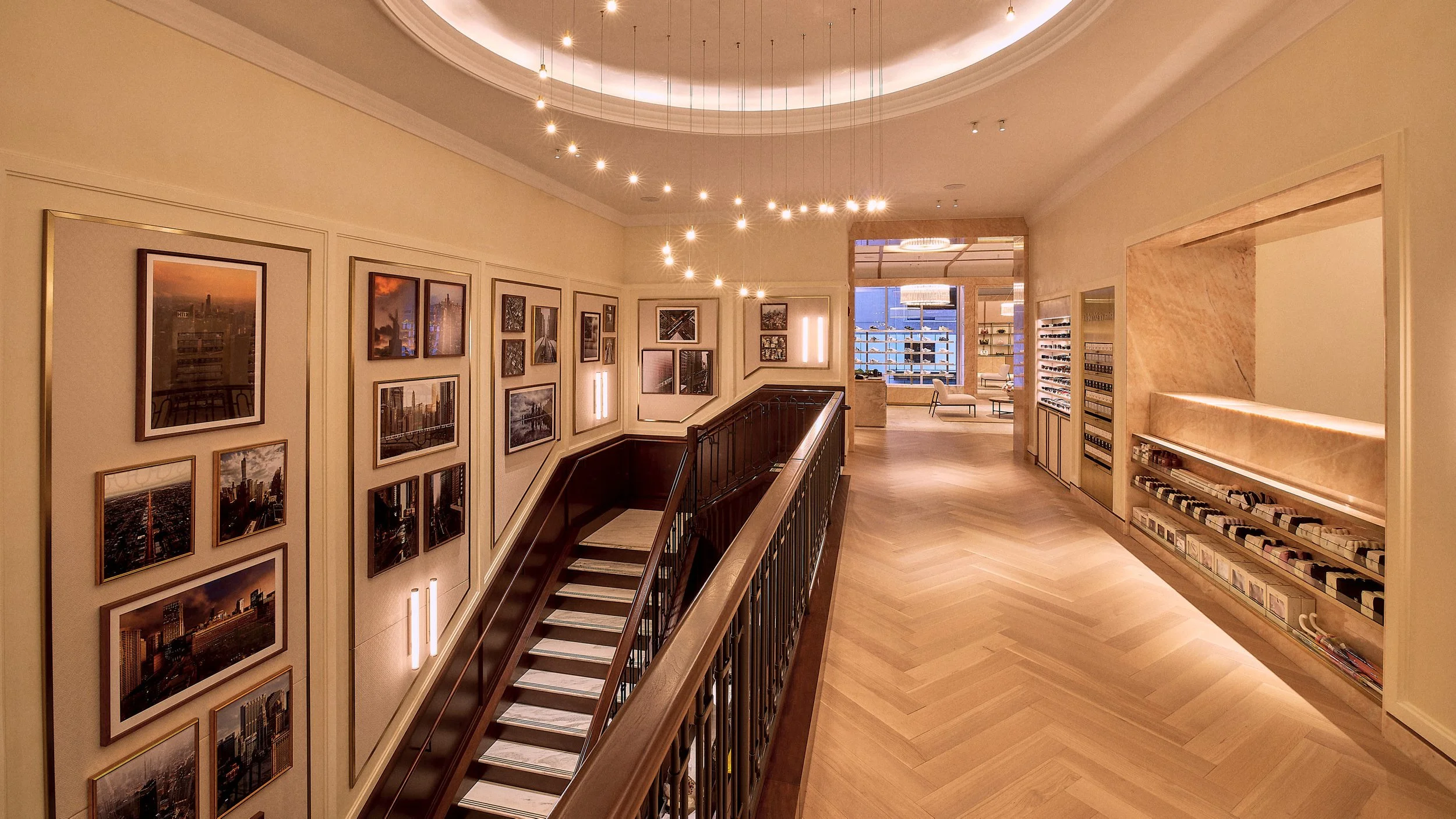


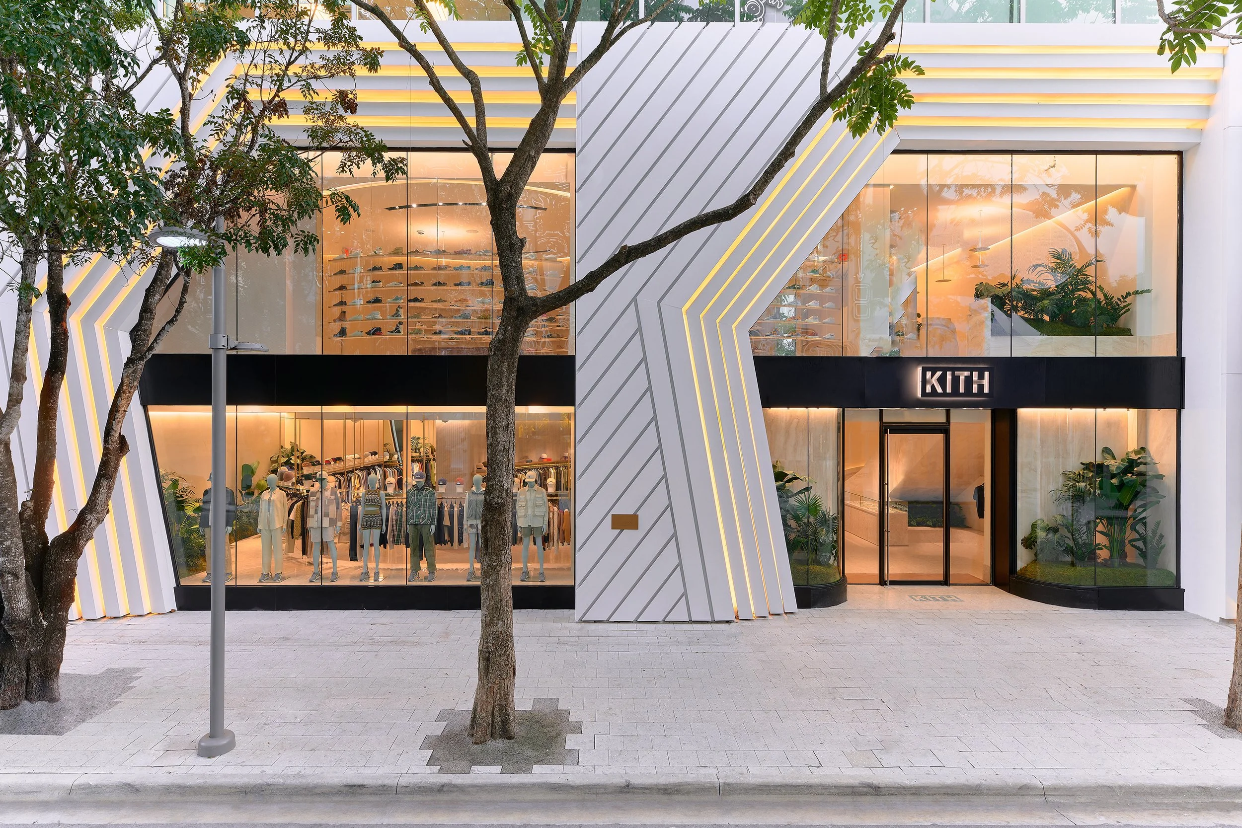


Fashion Retail
Global Flagships
London / Chicago / Osaka/ Malibu / Seoul / Women NYC / Toronto / Williamsburg / Miami Design District / Beverly Hills
The work is developed as an ongoing collaboration—an evolving architectural expression of Kith’s identity, translated into physical space.
Each project is approached not as a standalone store, but as part of a broader spatial language shaped in close dialogue with Ronnie Fieg. The goal is to give form to the brand’s distinct cultural position—one that merges refinement with accessibility, and operates as a lifestyle rather than a singular retail experience. Rather than relying on overt gestures, the environments are constructed through a more controlled and immersive framework, where identity is embedded in space itself.
A consistent yet adaptable material palette—stone, wood, plaster, and metal—establishes continuity across locations, while allowing each environment to respond to its specific context. Proportion, sequencing, and lighting are carefully calibrated to shape movement and perception, creating spaces that unfold gradually and maintain a sense of composure. Local references are integrated with restraint, grounding each project within its setting while maintaining a cohesive global identity.
The result is a body of work that extends beyond retail—environments that operate as a physical manifestation of the brand, where architecture, culture, and product are brought into alignment, supporting Kith’s continued evolution as a global lifestyle platform.
Soi School


Primary School
Bangkok, Thailand
2023
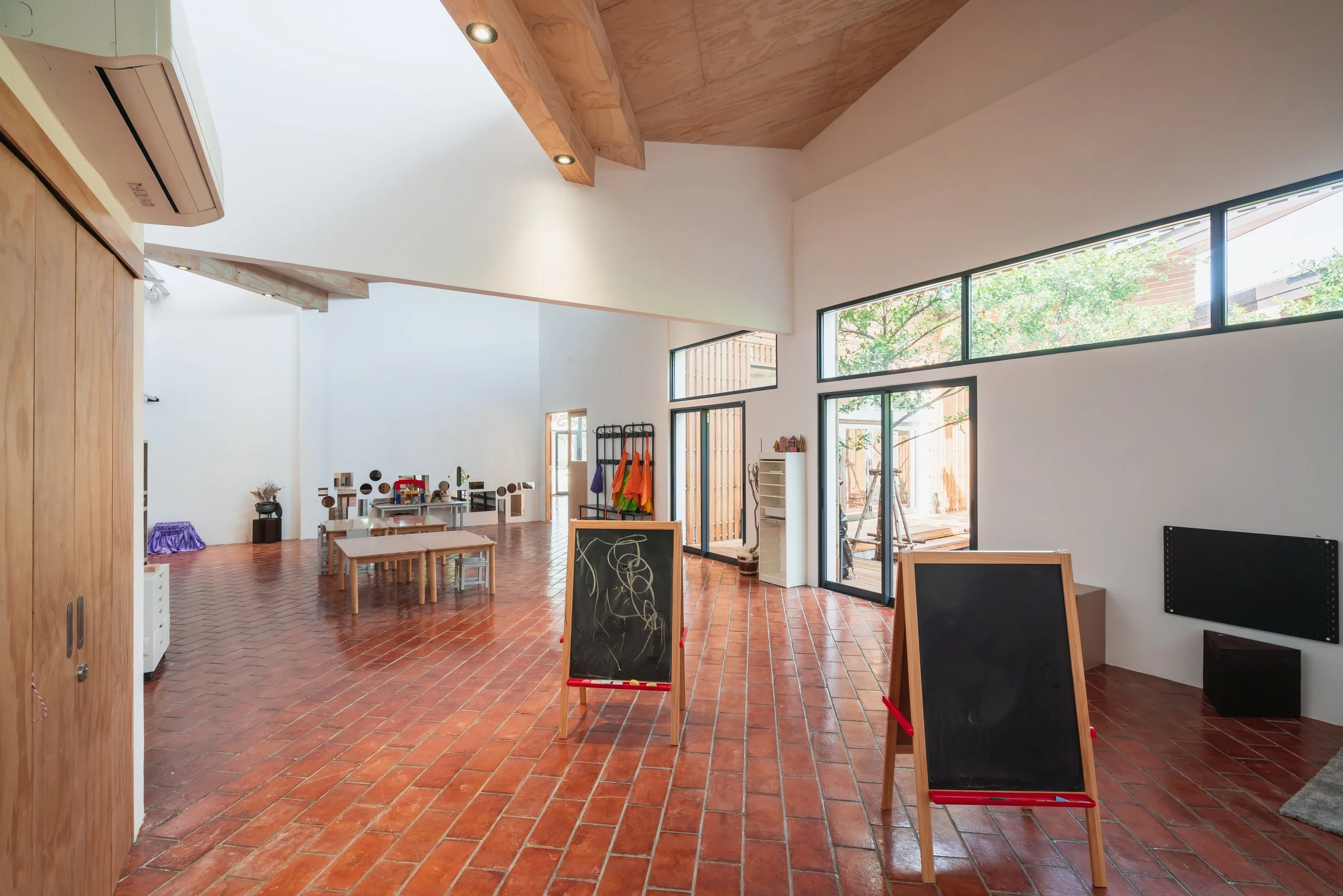
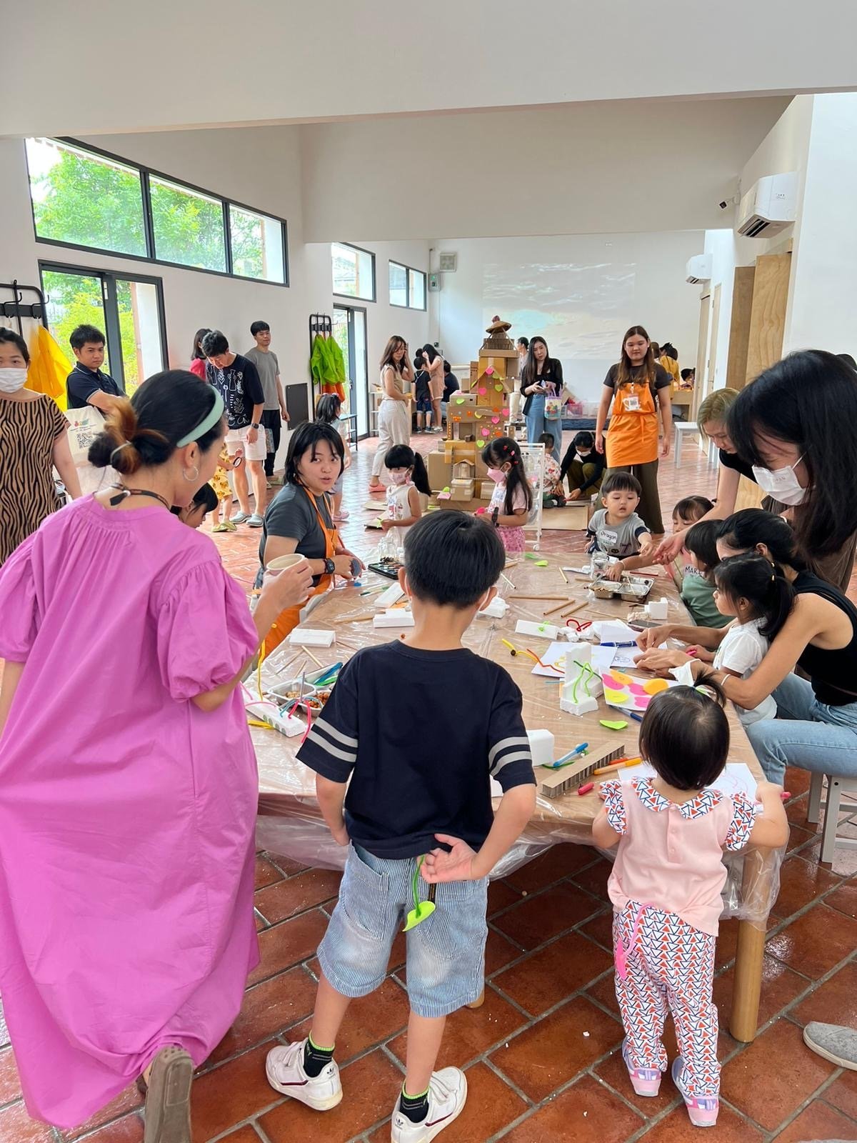
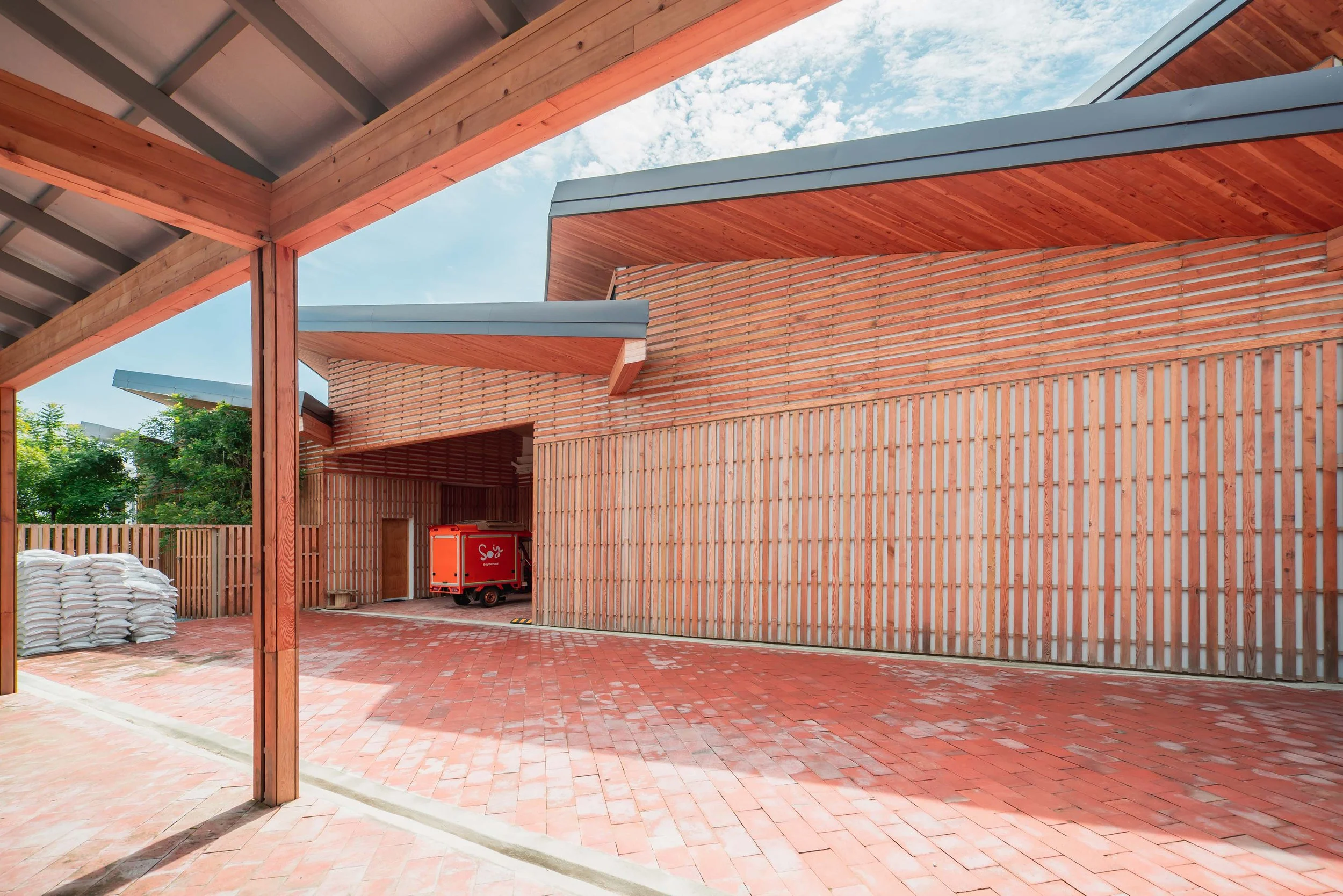
This facility is as an extension of Soi School’s founding idea—an adaptable educational model designed to expand access through mobility, community, and environment.
Originating as a single repurposed truck, the school’s initial ambition was to bring high-quality, play-based education to underserved neighborhoods across Bangkok. The permanent campus builds on this framework, establishing a central hub that supports a growing network of mobile classrooms while maintaining the school’s emphasis on flexibility and outdoor learning. Rather than separating building and landscape, the project is organized as a continuous environment, where indoor and outdoor spaces operate together as a single system.
The architecture is structured around an internal courtyard, with classrooms opening directly onto this shared space to allow for fluid movement between programmed and informal learning. A sawtooth roof introduces consistent natural light while mitigating direct solar exposure, reducing reliance on mechanical systems. Materials are locally sourced and simply assembled—wood, tile, and brick—creating a tactile and durable environment that is both practical and grounded in its context.
The result is an architecture that supports both stability and growth—anchoring the school’s operations while extending its reach. The campus operates not as a standalone building, but as part of a broader educational ecosystem, reinforcing a model that is accessible, adaptable, and built to perform, and to communicate.
Pop Up Grocer


Curated Grocery
Flagship Store
New York City
2023
This project is a transition from temporary to permanent—an environment that translates Pop Up Grocer’s curated, ingredient-driven approach into a more enduring architectural language.
Established by Emily Schildt with creative direction by Jen Levy, the brand is defined by its focus on discovery—bringing together a rotating selection of emerging food products centered on quality, transparency, and “better-for-you” sourcing. The flagship reinterprets this ethos within a fixed space, shifting from the immediacy of pop-up retail to a more stable and legible framework while preserving a sense of freshness and change.
The architecture is organized to support browsing as an intuitive and open-ended experience. Circulation is clear and continuous, allowing the space to be understood at a glance while encouraging movement and exploration. Rather than relying on overt visual cues, the environment is composed to recede—establishing a calm, elevated backdrop that allows packaging, color, and product variation to define the visual field.
Material and color are used with restraint. A refined palette builds on the brand’s recognizable identity while introducing a level of permanence appropriate to its first long-term location. Display elements are integrated into the architecture, maintaining consistency while allowing flexibility for rotation and change. The result is a space that feels both composed and adaptable, capable of evolving alongside the product it supports.
The project positions the grocery environment as more than a point of sale—operating instead as a platform for discovery, where product, brand, and space are brought into alignment. The flagship establishes a clear and lasting presence while maintaining the openness and accessibility that define Pop Up Grocer’s approach.
Okonomi


Japanese Cafe
Bangkok, Thailand
2021
This cafe is a quiet architectural framework for Okonomi’s approach to food—an environment that reflects the clarity and restraint of its cuisine.
Developed in collaboration with chef Yuji Haraguchi, the original location transforms a former Thai massage parlor into a small, neighborhood restaurant in Bangkok. The design avoids embellishment, instead focusing on proportion, material, and atmosphere to create a setting that feels both intimate and composed. Drawing from the sensibility of Japanese home cooking, the space is conceived to support a balance between simplicity and precision—where nothing is excessive, and each element contributes to the overall experience.
The material palette is restrained and tactile. Japanese cypress, regional slate, and a muted exterior wash establish a calm and grounded presence, while interior elements are kept deliberately minimal to allow the activity of the space—preparation, service, and gathering—to define its character. Light is softened and diffused, reinforcing a sense of warmth without disrupting the overall clarity of the environment.
Subsequent locations build on this foundation, extending the original concept into a series of smaller, site-responsive environments. Each adapts in tone, color, and material to its context, while maintaining a consistent architectural language that ties the locations together.
The result is a collection of spaces that operate with quiet consistency—each one distinct, yet clearly part of a shared identity. The architecture remains understated, allowing the experience of the food and the rhythm of the space to take precedence, creating an environment that is both immediate and enduring.
Daily Harvest

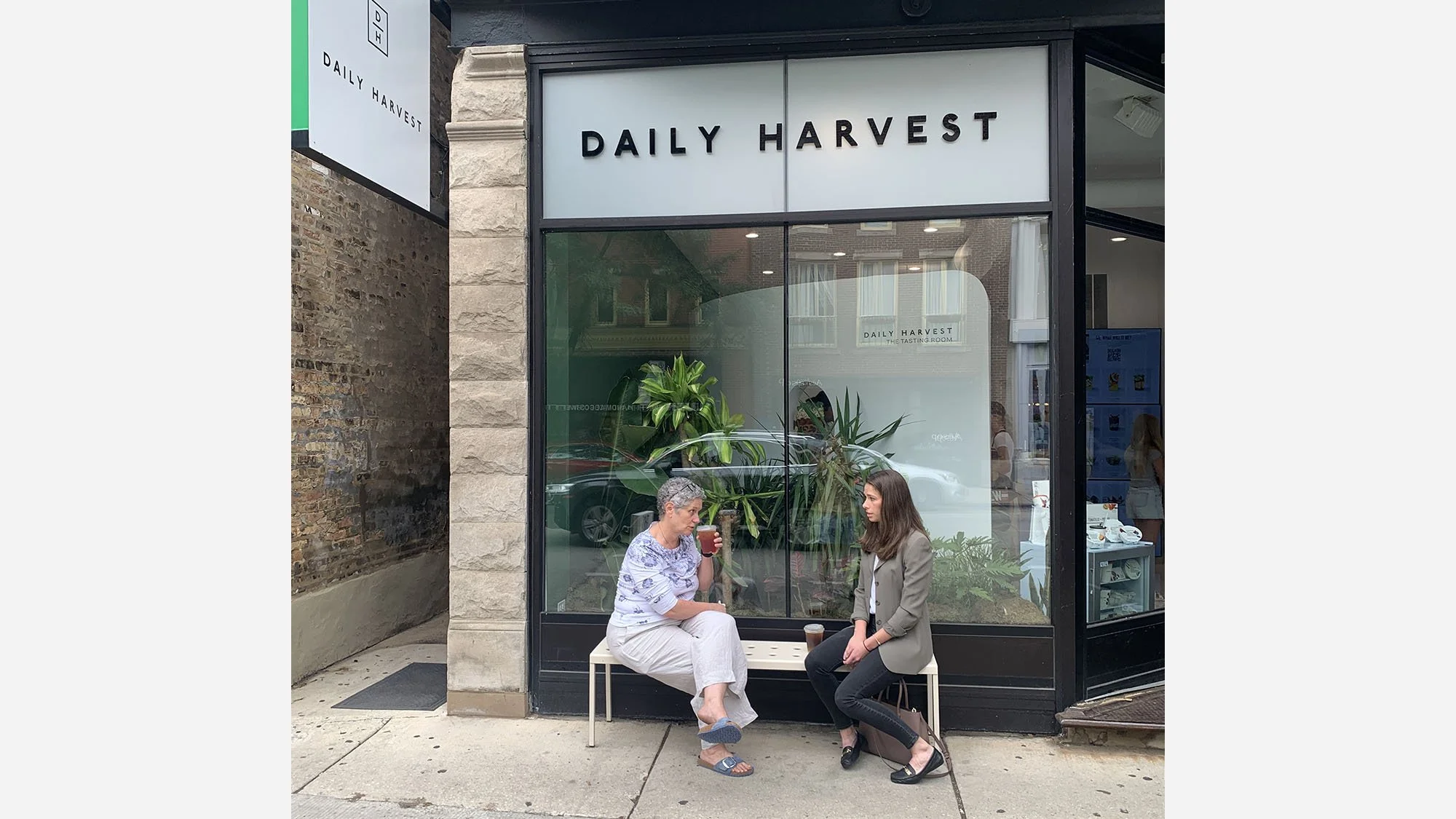


Tasting Room
Chicago, Illinois
2022
This tasting room is a physical extension of Daily Harvest’s ethos—an environment that translates the brand’s commitment to transparency, sustainability, and ingredient-driven food into spatial experience.
Developed as a temporary tasting room in Chicago’s Lincoln Park neighborhood, the installation reinterprets the brand’s digital-first presence as a tangible, immersive environment. The architecture is organized as a simple, legible volume, allowing the focus to remain on the core narrative: the journey of ingredients from source to consumption. Rather than relying on graphic messaging, the space communicates through sequence and material—guiding visitors through a series of moments that reflect cultivation, preparation, and nourishment.
Plantings are integrated directly into the architecture, weaving in, out, and through the structure to blur the boundary between built form and landscape. This integration reinforces the brand’s connection to farming while creating a spatial progression that is both intuitive and experiential. Movement through the space becomes part of the story, with each transition marking a shift from origin to finished product.
Material choices are intentionally minimal and natural, establishing a quiet backdrop that allows texture, greenery, and product to take precedence. The environment is designed to feel open and accessible, supporting both circulation and informal gathering while maintaining clarity of intent.
The result is an architecture that operates as a narrative device—one that makes the brand’s values visible and immediate. By combining structure and landscape into a single system, the tasting room creates a clear and engaging expression of Daily Harvest’s identity, built to perform, and to communicate.
Beer Belly


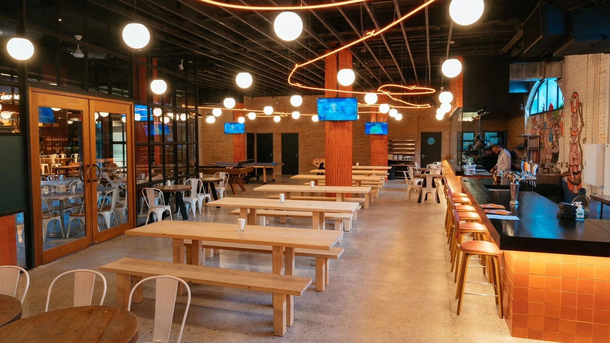


Beer Hall
Bangkok, Thailand
2022
With a name like Beer Belly, visitors know what they're getting into from the start! But instead of leaning too far into the beer hall aesthetic, we brightened things up with local tile work, custom neon artistry and graphics. Chon gâew!
Beam Bar


Bar / Music Venue
Bangkok, Thailand
2021
Beam Bar is an exploration of color as an architectural medium—an environment where light, material, and form work together to shape perception and atmosphere.
Organized across two levels, the design establishes a progression from applied color to embedded color. On the ground floor, a series of carved wooden volumes define seating areas and a DJ stage, creating a spatial landscape within the room. These elements are activated by a gradient wash of colored light introduced through the facade, producing a shifting, kaleidoscopic effect that transforms the perception of the space over time. Color is not fixed, but atmospheric—something that moves across surfaces and gathers within the geometry of the room.
Above, the approach becomes more integrated. Color transitions from light to material, embedded directly into the architecture through a custom palette of tinted concretes. The bar and seating are cast as continuous elements, where tone and texture are inherent rather than applied. This shift creates a more grounded and immersive condition, balancing the dynamic quality of the lower level with a sense of permanence and cohesion.
The result is an environment defined by variation and continuity—where color operates across light and material to shape a distinct spatial identity. The project moves beyond decoration, using color as a primary architectural tool to create a space that is both immersive and controlled.